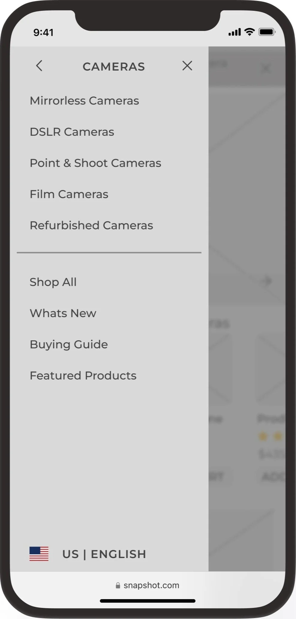
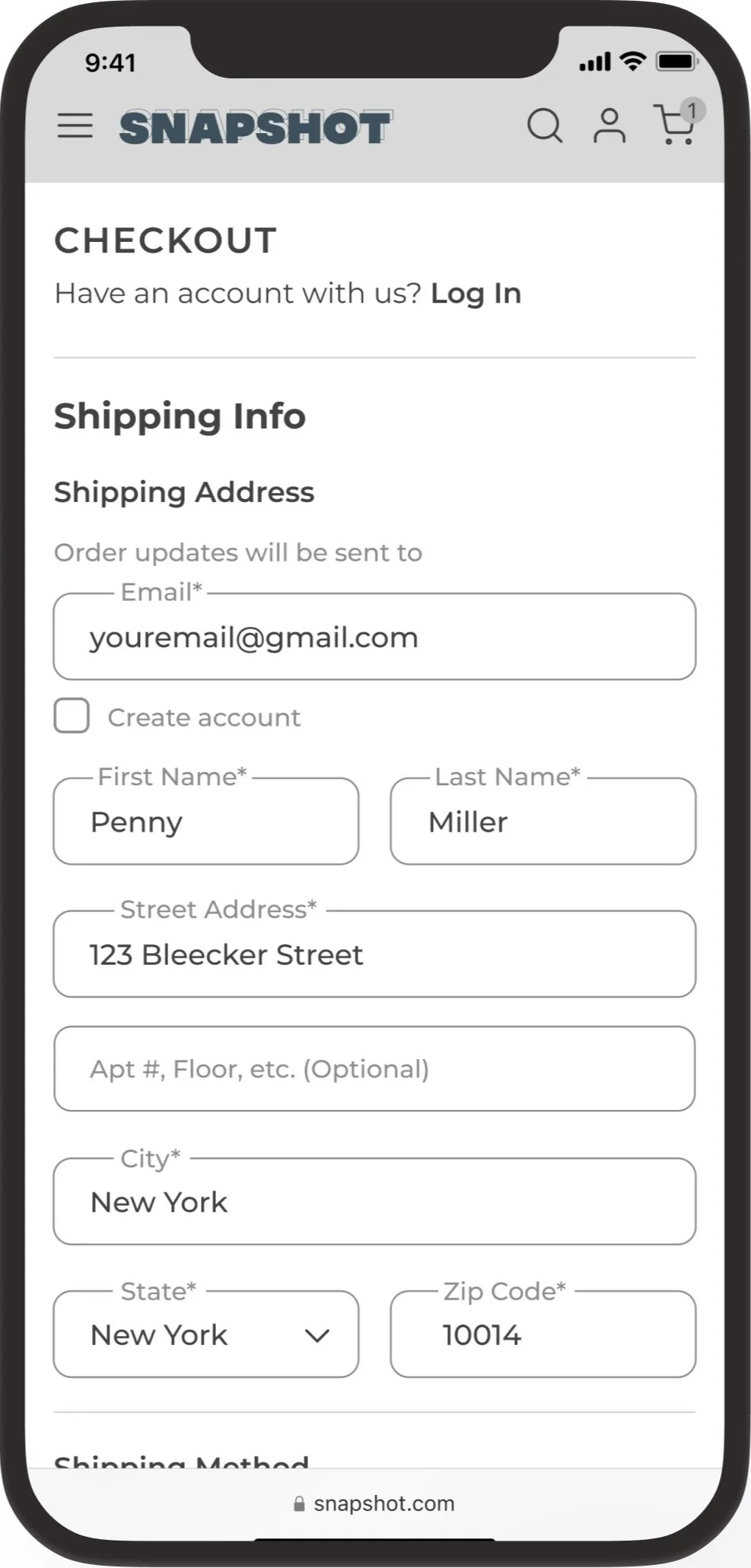
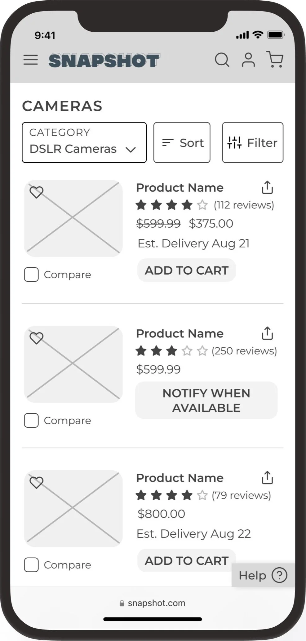
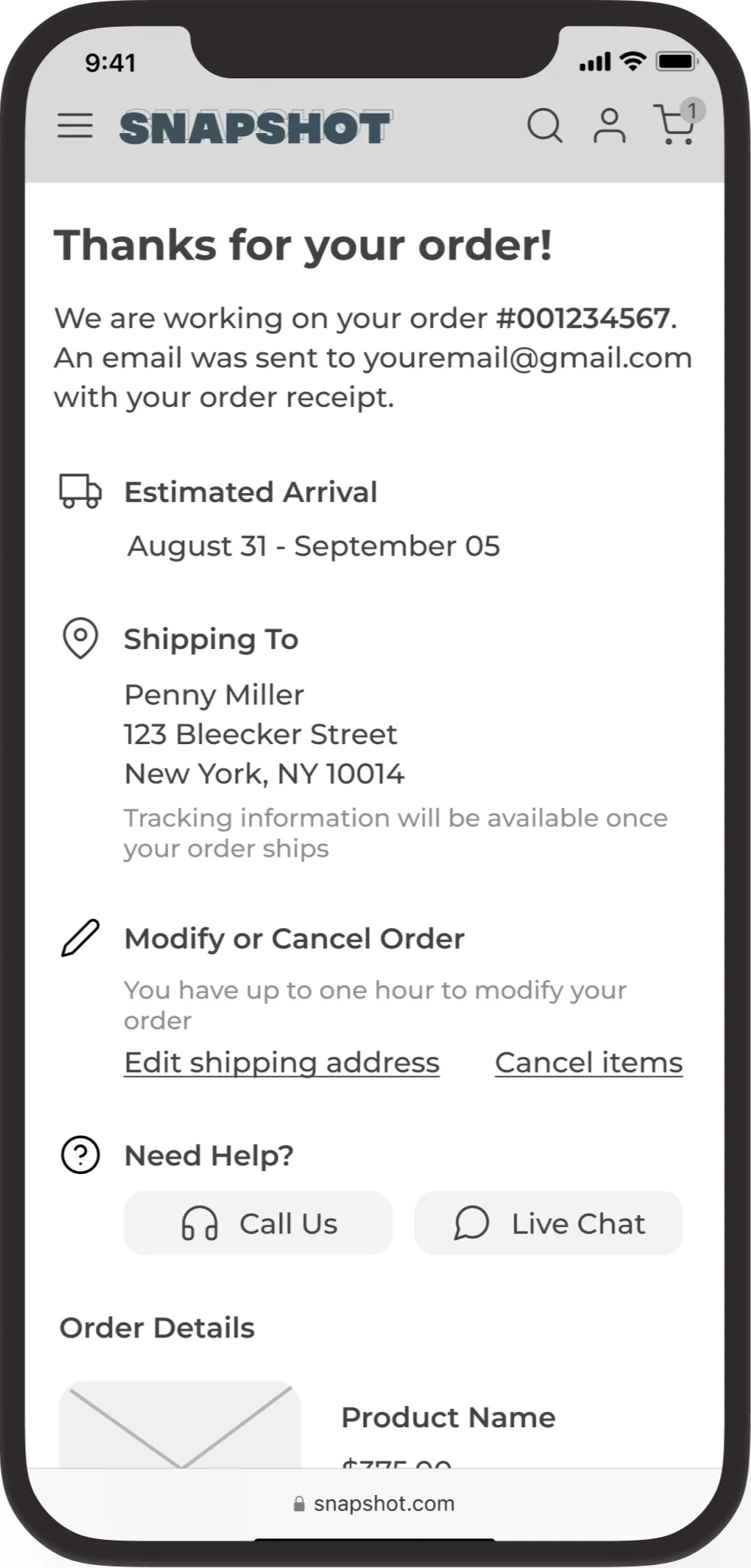
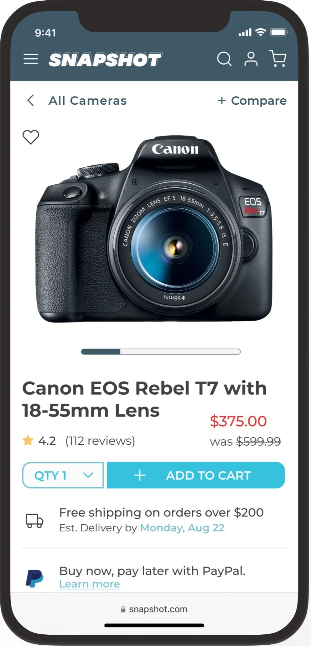
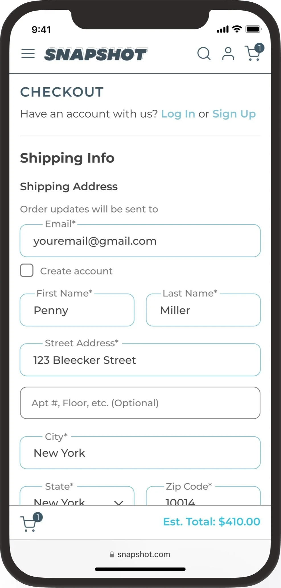
Snapshot 📸
Snapshot is a conceptual online retailer that sells cameras and camera gear. The goals of this project were to improve the company’s conversion from browse to completion of checkout to increase revenue on the product’s mobile-web experience.
Role: UX Researcher, UX Designer, UI Designer
Project Context: Personal Project
Product Type: Mobile E-commerce Site
Duration: 1 month
Tools: Figma, FigJam, Zoom
For this project, we were given the choice between several different industries/scenarios with a business problem to solve. Being interested in the e-commerce space, I chose to work on the e-commerce scenario. I was provided with a business problem, company goals, and company data related to the problem. I chose to work in the photography space of e-commerce as I have always been interested in photography and thought this would be an engaging way to learn more about the photography business and its role in the e-commerce industry.
Problem
The company is experiencing high shopping cart abandonment and low conversion rates.
Company data shows that 50% of users on average open 7 item pages and then abandon the site without moving any items into the cart. Additionally, 70% of users who place an item in the cart do not purchase and abandon cart at the registration page. At the moment, users are required to create an account to purchase.
Solution
Adding a product comparison feature and option to checkout as a guest.
The company’s PM hypothesizes that users abandon the site without moving any items to the cart because they are unable to determine which camera is best based on relative features. The PM also hypothesizes that a guest checkout option will solve for users abandoning cart at the registration page.
Design Process
Research
With secondary research, my goal was to discover what causes users to abandon carts, bounce from sites, and other statistics involving e-commerce business, abandon cart rates, and mobile-web experiences.
35% of customers abandon their cart due to account creation requirements.
60% of online shoppers say that shipping speed has a significant impact on purchase decisions.
The average bounce rate for e-commerce businesses is set at 46%.
About 84% of cart abandonment rates come from mobile devices.
Understanding user’s motivations to shop online and the constraints that hinder them from doing so is important to execute a design that will drive users to complete checkout processes and businesses to increase their conversion rates.
Secondary Research
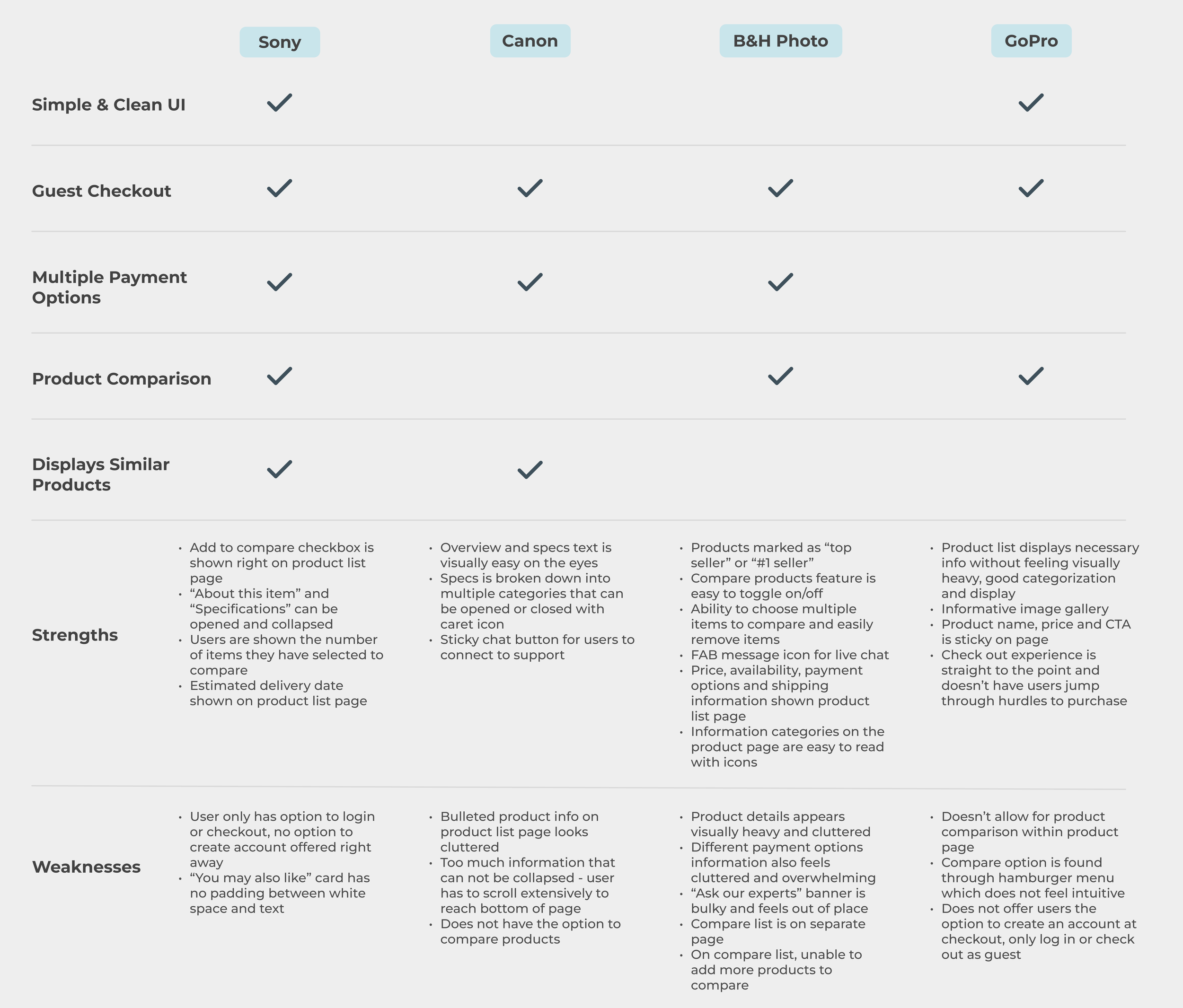
Using a heuristic analysis approach, I looked to industry leaders to understand industry best practices, gain insight into design principles, and compare checkout experiences. The major retailers I chose to analyze that are big in the photography space were GoPro, Canon, B&HPhoto, and Sony. I also looked to major, successful online retailers to draw inspiration from like Amazon and Walmart.
Competitive Research
Define/Ideate
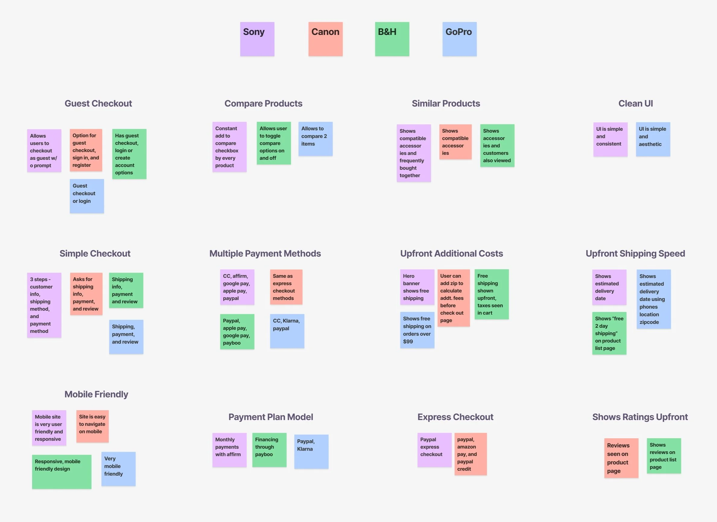
Following my research, I created an affinity map to help synthesize all of the data that was collected. I was able to break it down into 12 categories. Of the 4 industry-leading companies, the one that really hit *almost* every mark was Sony. They had the most user-friendly site that had all the requirements the PM is hypothesizing would improve conversion rates.
Affinity Mapping
When it came to coming up with a solution I kept these business goals at the forefront:
Create a guest checkout option that captures users’ email address to maintain communication and customer relations
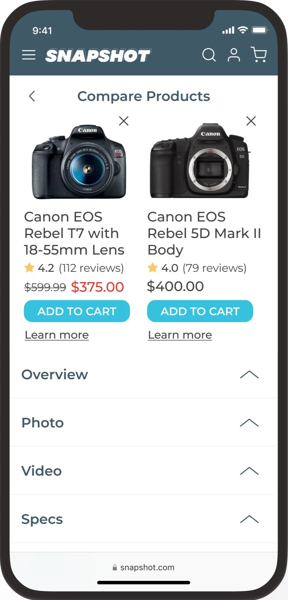
Give users the option to compare products to make better decisions
I also considered pain points from the user flows on the competitors I completed my heuristic analysis on, with most emphasis on:
Taking the user out of the flow to a separate page for comparing products
Overwhelming amount of information and specs on product details
Offer option to create an account
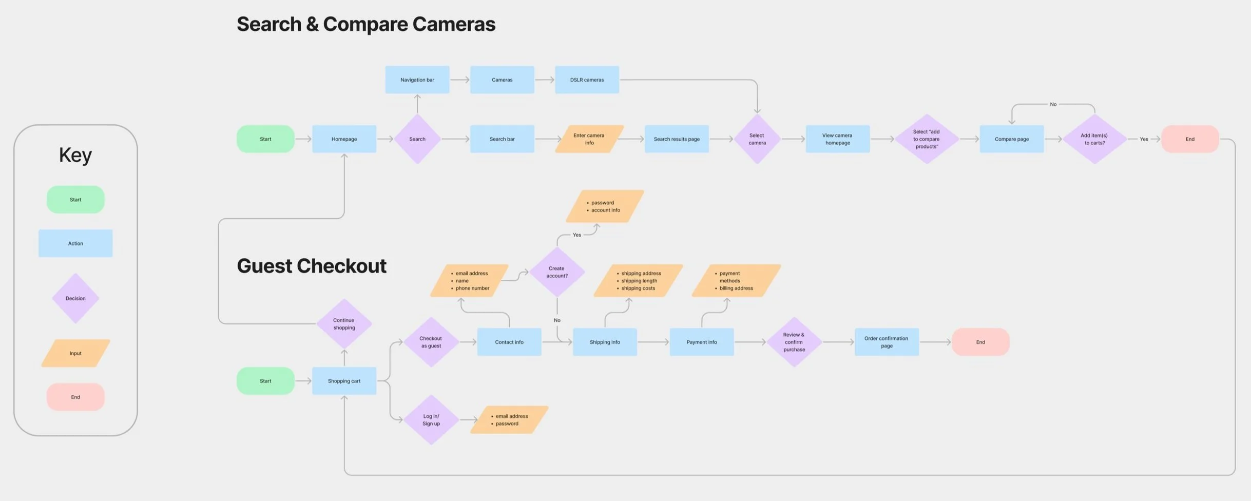
With these things in mind, I mapped out the steps a user would take from browse to checkout completion and the steps a user would take to compare products while browsing.
Solution Ideation
Prototype/Test
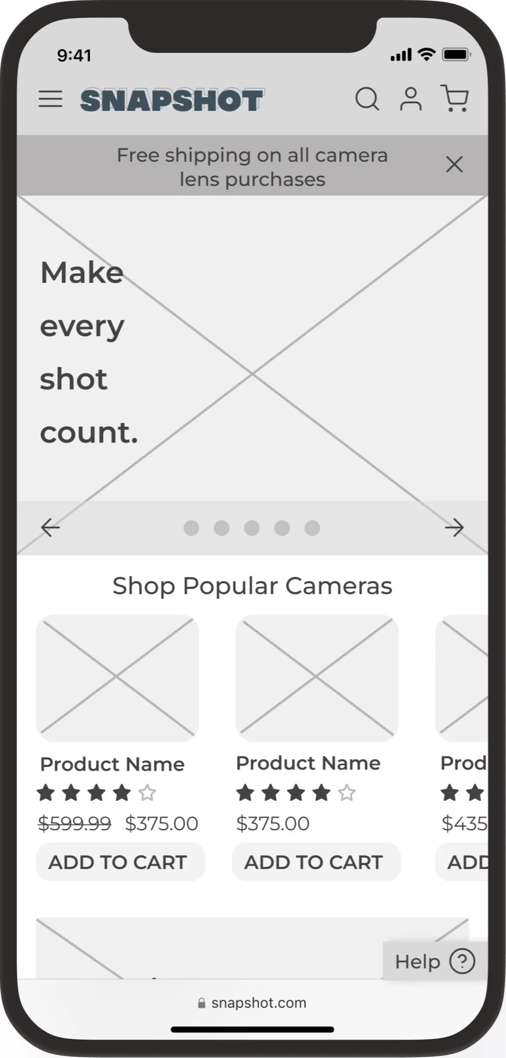
Having the user flows mapped out and using all the data gathered during the research phase, I brainstormed and designed low-fidelity screens out of the critical screens required. I decided to design the lo-fi screens on Figma rather than sketch to save time and also get certain details and dimensions set so the transition to high fidelity screens would be smooth.
Low Fidelity Prototype
I was able to recruit 5 participants for a moderated usability test of the lo-fi screens. Users were given 3 main tasks:
Find a decently priced DSLR camera with good reviews and compare to another camera
Click on the best camera and explore the camera product page
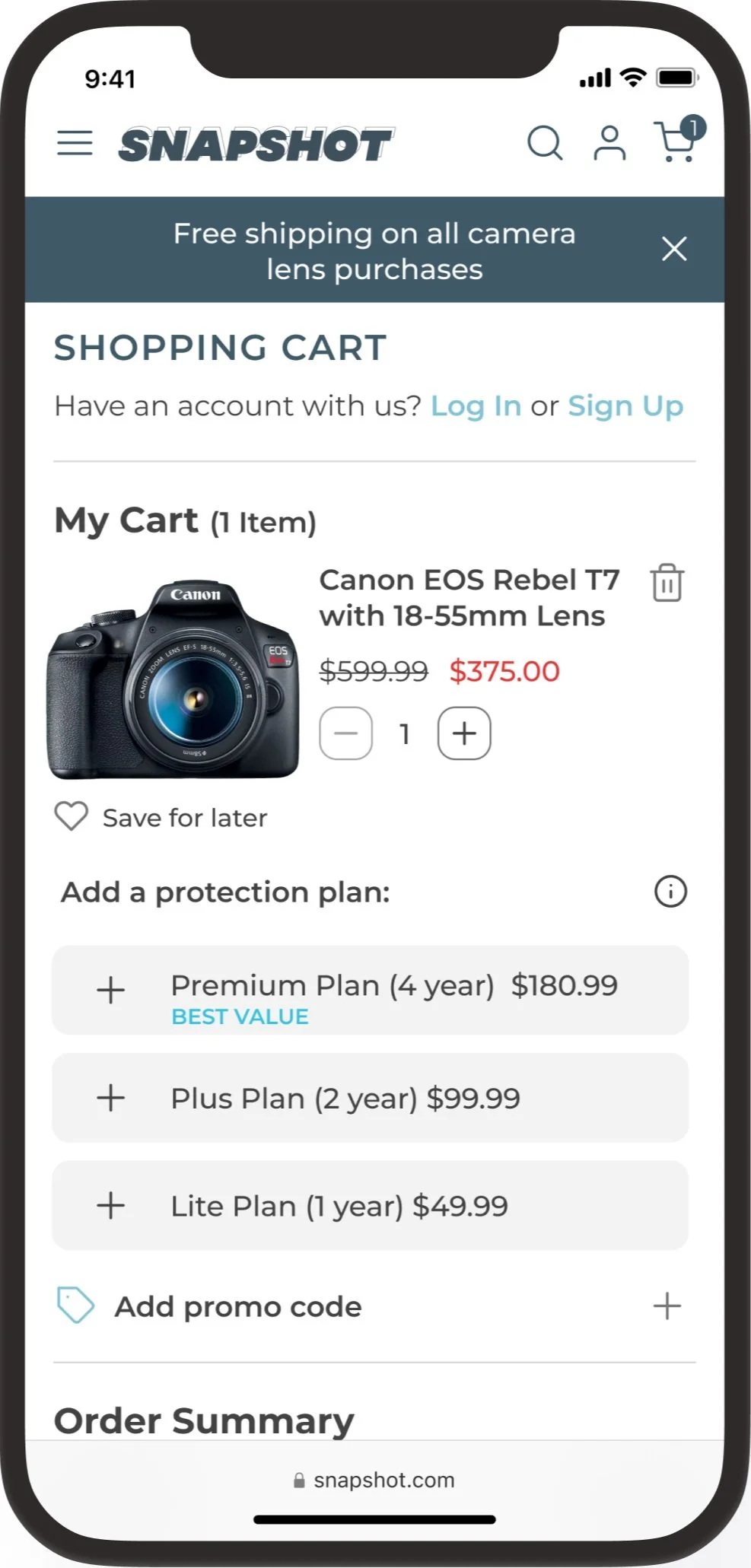
Add that camera to cart and go through checkout as a guest
Usability Testing - Round One
The biggest issues found during this round of testing were:
Compare feature - specifically when prompted to add another product to compare with.
Summary: 3/5 users attempted to click the “+” icon to add an additional camera to compare, not realizing it wasn’t an interactive element and they were meant to scroll through the list to pick another camera to compare with.
Recommendations: Make the function more clear to users by changing the “+” icon to something that better indicates to the user that it is not an interactive element until they add a product to compare with.
Compare card takes up too much real-estate on the bottom of the screen.
Summary: 2/5 users wished they could move the compare card out of the way so they could view the entire page.
Recommendations: Adding an interactive element that users can swipe up to bring up the compare card and swipe down when they don’t want it in view.
Iterate
After the first round of usability testing, I made iterations to the lo-fi screens to implement the most critical feedback.
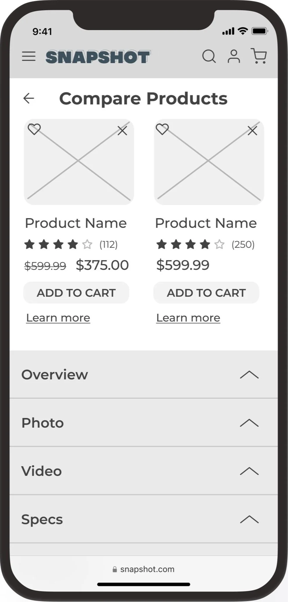
Compare Feature
To make this feature more clear to users I did the following:
Replaced the “+” icon with a camera icon to indicate a is a placeholder and where a real image of a camera will be once another product is selected to compare.
Added a dotted border to the image box to indicate that it will change depending on what action the user takes.
Added text to indicate how many products are selected out of the total number of products needed to select in order to compare (ex. 1 of 2 products selected)
Changed the text to give clear instructions on what the user needs to do to add another product
Grayed out the text and the camera icon to indicate that this area is disabled or inactive until a user adds another product to compare.
Compare Card
To help take back some screen real estate, I decided to add a bar that allows users to swipe up to bring it into view and swipe down when they want it out of the way.
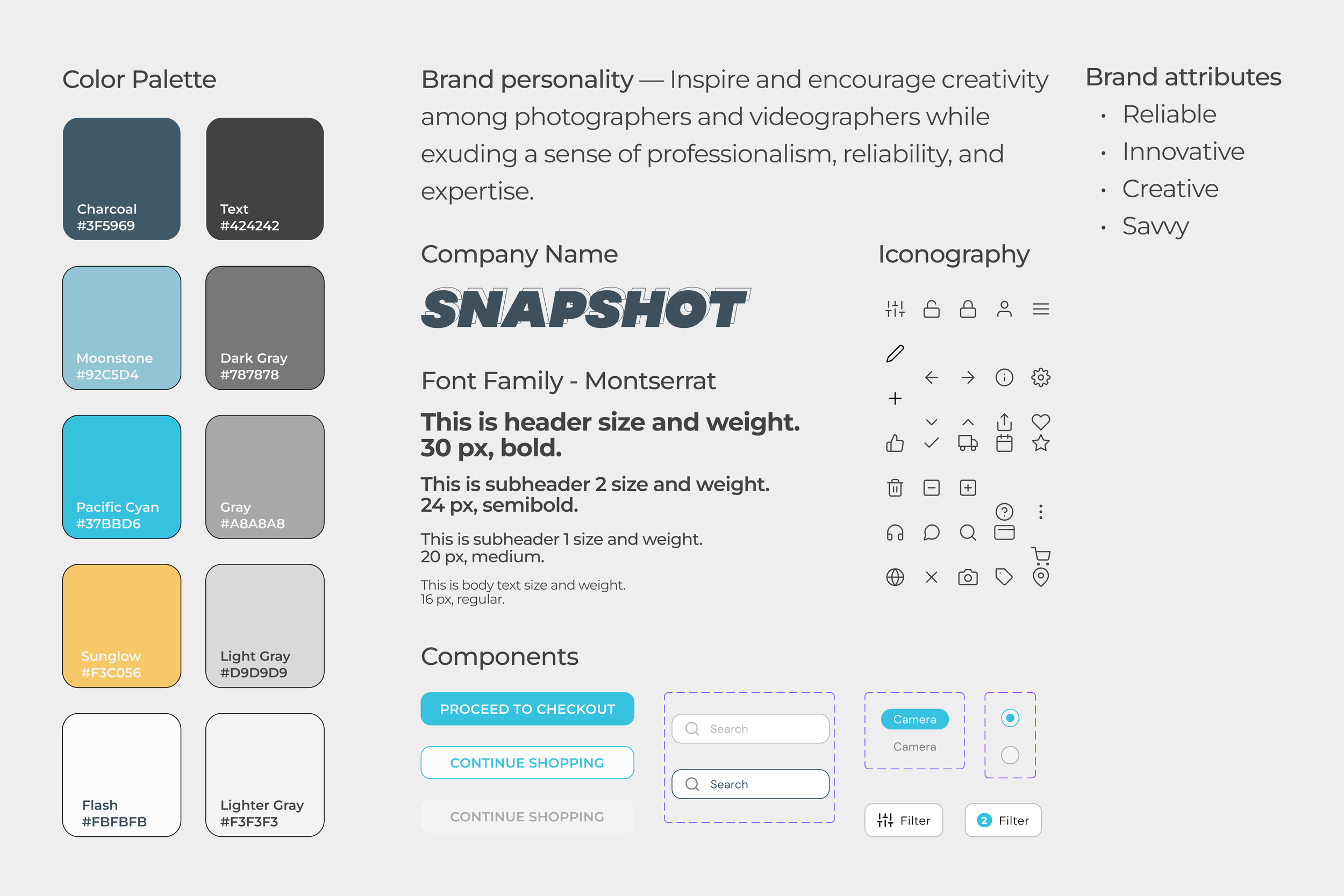
With the lo-fi screens being finalized, I took the time to create my style guide before moving on to designing and prototyping the hi-fi screens.
Style Guide
High Fidelity Prototype
click here to interact with the prototype in Figma!
Test/Iterate
With the high fidelity screens finished, a second round of testing was done. I recruited 4 new participants for another moderated usability test. During this round, only 1 user felt the compare card was still taking up too much space, while the other 3 users didn’t mention anything about the compare card. 2/4 users mentioned that they liked how they are able to swipe the card up into view and down out of sight.
With only 1 user having negative feedback, I decided it wasn’t a critical issue that needed to be fixed or iterated on. With the second round being completed and users being able to finish the necessary tasks to fulfill the business goals, I did some minor tweaking on the screens and finalized the designs.
Reflection
Working on an e-commerce project was a lot of fun! It was something I definitely wanted to dabble in as it is one of the industries I am interested in working in, I’m also a huge online shopper so I thought it would be fun to be on the other end of the screen.
To be candid, the compare feature was definitely the biggest headache of this whole project. It is definitely a necessary feature to have on a site selling expensive camera equipment as it helps users make the best choice for them, but it was very challenging. Lots of thought and iteration went into reaching the final compare feature! I absolutely understand now why on some sites their compare feature might be finicky or they only allow for 2 items to be compared at a time. 😅
From the beginning, I knew I wanted to keep a maximum of 2 items to compare because all the websites I tried that had more than 2 items had a very buggy experience that would lag or it would be difficult to scroll through and see all the information you need on the products. So to avoid that entirely, I stuck with 2 items. If I had more time, I’d do a deeper dive into this and see how to make the experience of comparing multiple items more user-friendly.
