Peer Linked 💬
This Industry Design Project (IDP) focuses on giving Springboard collaborators hands on experience to provide insight and support to a new or existing product. I was assigned to My Student Wellbeing, a Canadian startup company that focuses on student wellbeing. The founder wanted to start a new venture that aims to support students in another way. Peer Linked is a web application that aims to improve the social aspect of the university experience for students, helping them discover events that align with their interests and like-minded peers to attend with. Over 4 weeks, my team of 2 other designers and I redesigned the existing site to meet industry standards, improve usability, and increase web traffic while following the company’s branding and requirements.
Role: Team Lead, UX Designer, UI Designer
Project Context: Internship with My Student Wellbeing
Product Type: Web Application
Duration: 1 month
Tools: Figma, FigJam, Zoom
Team:
Jeanine Echevarria - Team lead, UX/UI designer
Andrea Hoang - UX Researcher, UI Designer
Rada Yeskanderov - UX Researcher
Problem
University students often struggle to find friends and events that align with their specific interests.
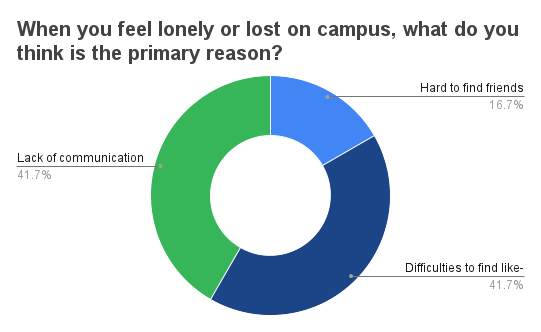
72% of students feel lonely on campus- many admit this is due to difficulties finding like-minded people and lack of communication. Students are more motivated in attending events when they have a genuine interest in the subject where they can expand their social networks and meet new people with similar interests in a relaxed, non-academic setting.
Solution
Increase conversion rate of students finding others that match their interests and attending events.
Provide users with an improved way to find other peers with similar interests and finding events that match their interests, increasing conversion rates of students attending events and making connections.
Problem Statement
How Might We enhance the university experience for students by seamlessly connecting them with events tailored to their interests and facilitating meaningful connections with peers with similar interests?
Project Constraints
The following constraints from the founder were highlighted throughout the process:
Design for a web app
Utilize the same colors and fonts as used in their other product (My Student Wellbeing)
Link users to My Student Wellbeing in the footer
Target users are post-secondary students (college/university)
Create the option for users to connect (add to friends, chat, etc.)
Design for the location to be within Manitoba, Canada
Design Process
Discover
Qualitative survey
Secondary research
Competitive analysis
Heuristic analysis
Ideate
Affinity mapping
User persona
Sitemap
User flows
Design
Low fidelity wireframes and prototypes
High fidelity wireframes and prototypes
Branding
Validate
Guerilla testing
Usability testing
Design Iterations
Discover
The client already had an existing site that was not currently live, as they wanted to improve the look and functionality before publishing it. They had 3 different accounts part of the structure of their web app- attendee, event organizer, and administrative (client’s account). Due to time constraints, the team and client decided to prioritize designing the user flow for the attendee portion of the site.
With only 4 weeks to complete this project, we decided to use discovery methods like qualitative survey, competitive analysis, and secondary research as we felt they would give us the necessary information needed without compromising our timeline.
Qualitative Survey and Secondary Research
For the survey, we recruited 17 participants online through various social platforms. The target participants must currently or have recently attended post-secondary education (college or university). The secondary research was conducted online and supported the responses we received on the survey. Our main goal through these methods was to find university student’s pain points and needs when finding events to attend and making friends. Below is the most insightful information from the survey.
We chose to complete a competitive analysis to see what industry leaders are offering to their users that work and don’t work. We also used these companies as inspiration for app features and UI elements. Facebook seemed to be the weakest competitor while Meetup seemed to be the strongest competitor and most similar to what the client is looking for us to build.
Competitive Analysis
I also decided to do a heuristic analysis of the client’s current web app. The client admitted when they created their site for Peer Linked, they quickly put together the structure and basic functionality of how they wanted their product to work, but felt it needed to “look nicer and be more user-friendly”. I wanted to look at what they currently had to see what their idea was when first starting this venture and how to improve on it using UX and UI standards.
💡 View the analysis here
Additional - Heuristic Analysis
Ideate
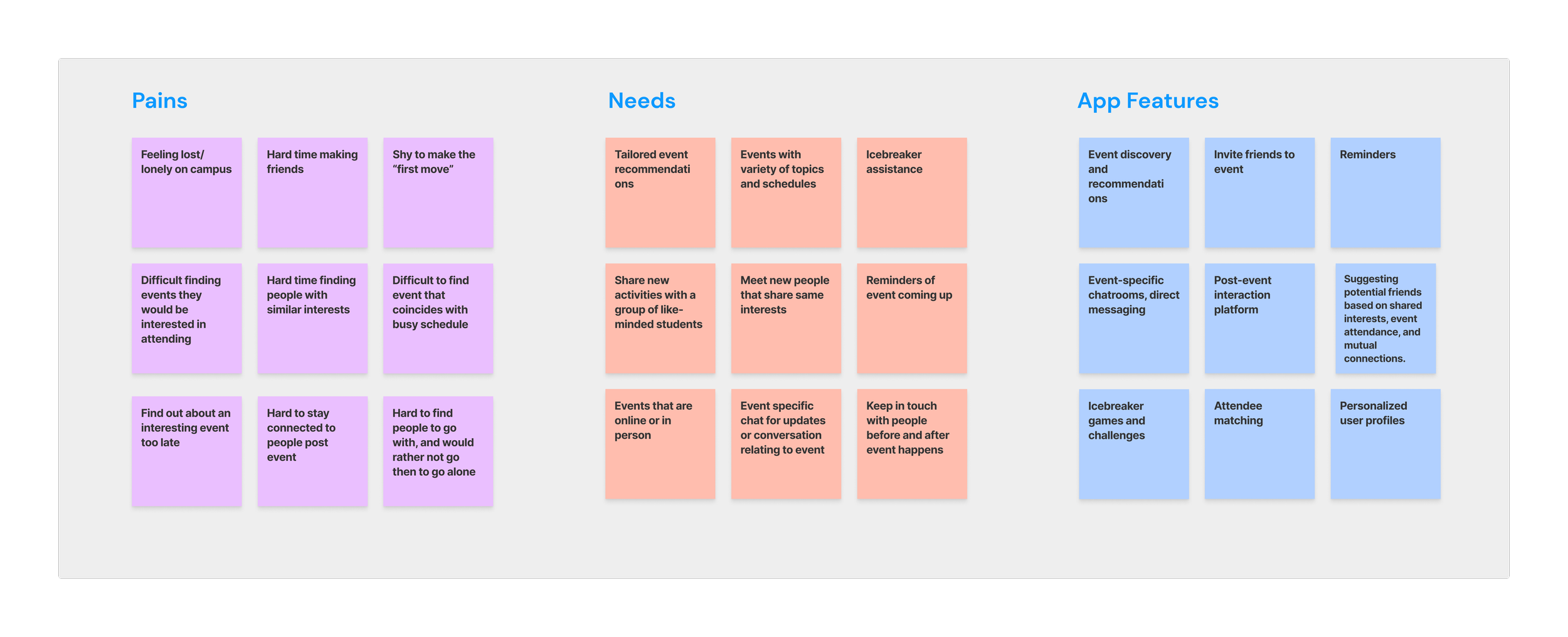
With all the information we collected from the discovery phase, we created an affinity map to help organize the common themes that came up in our research into 3 main categories: needs, pains, and app features. We highlighted the main points to keep in mind in each category as we move forward with ideation and design.
Affinity Mapping
We also created a persona that embodies all the information from our research into what the average user of this product would be like. Having this and being able to reference back to it as we went through designing and testing was extremely helpful, as it keeps bias and opinions away allowing us to focus on decisions that benefit the user and support the client’s requests.
User Persona
We created a sitemap to lay out a foundation for the structure and main content of the web app. This helped us understand the overall flow of the web app while also keeping us organized before moving on to creating user flows and designing low-fidelity wireframes.
💡 View the sitemap here
Sitemap
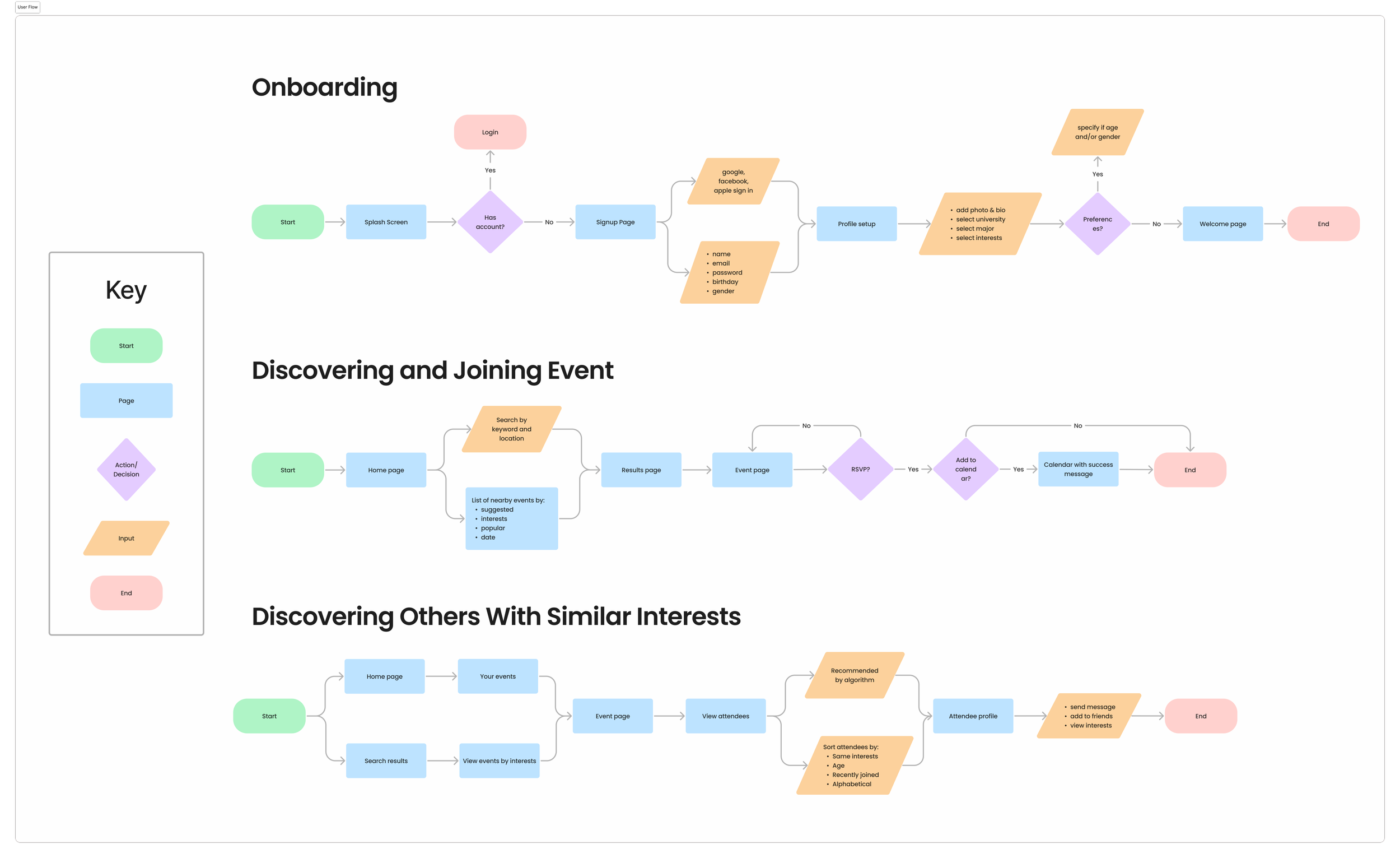
With a deeper understanding of what the users want, what the client wants, and the direction we were going to take for this design, we created 3 user flows that we felt were necessary to focus on with our limited time- onboarding, discovering and joining an event, and discovering peers with similar interests.
User flows
Design & Validate - Low Fidelity
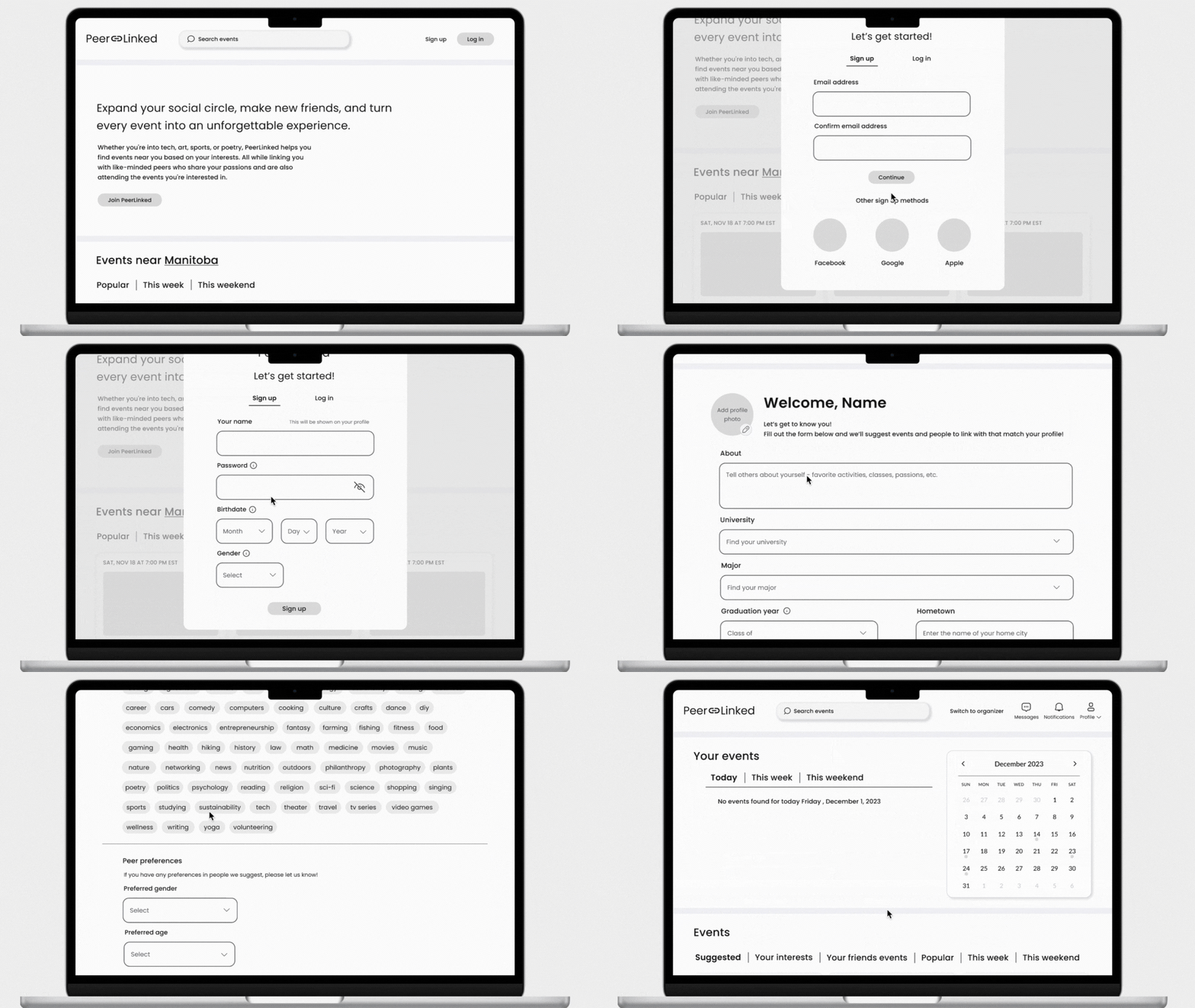
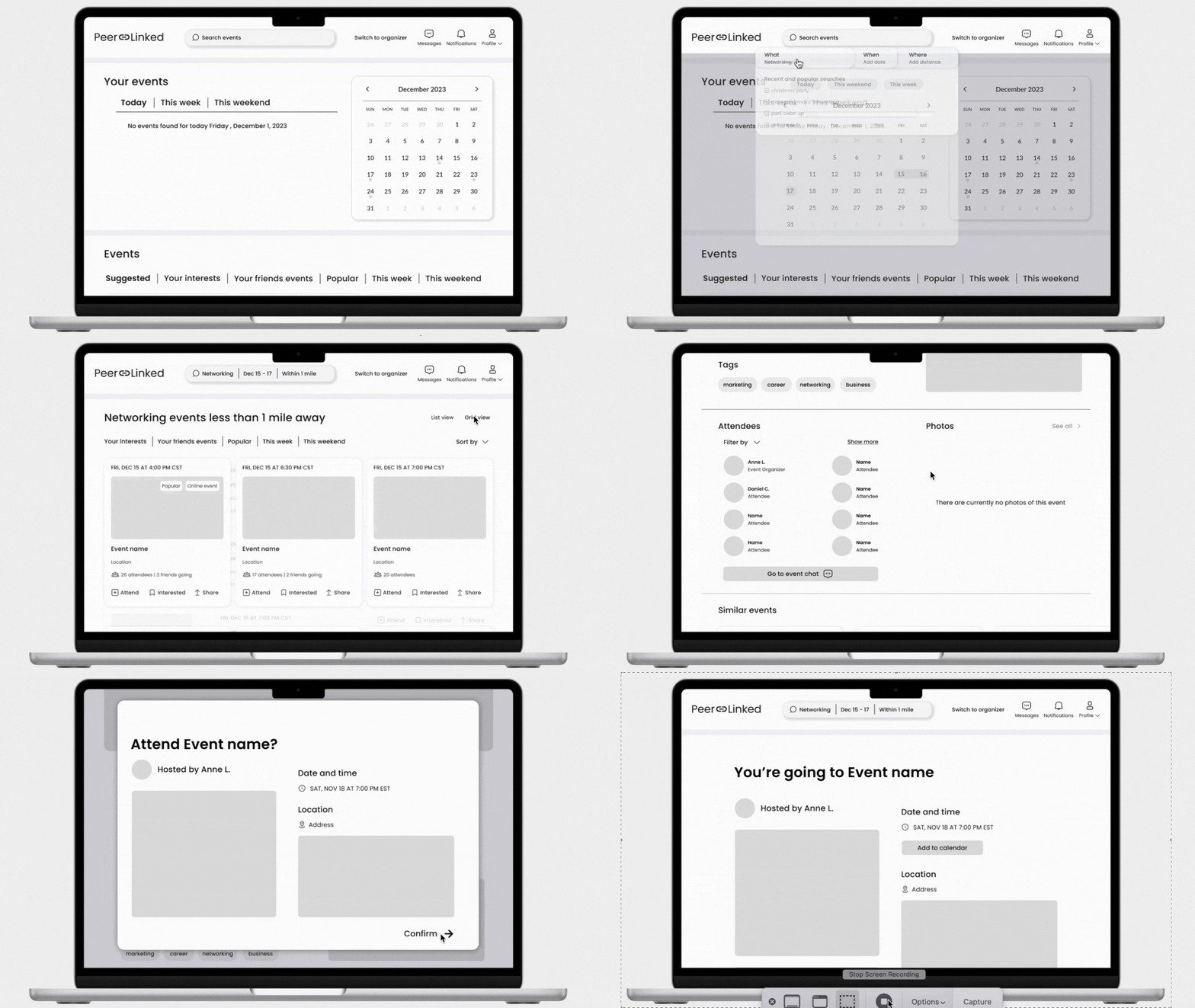
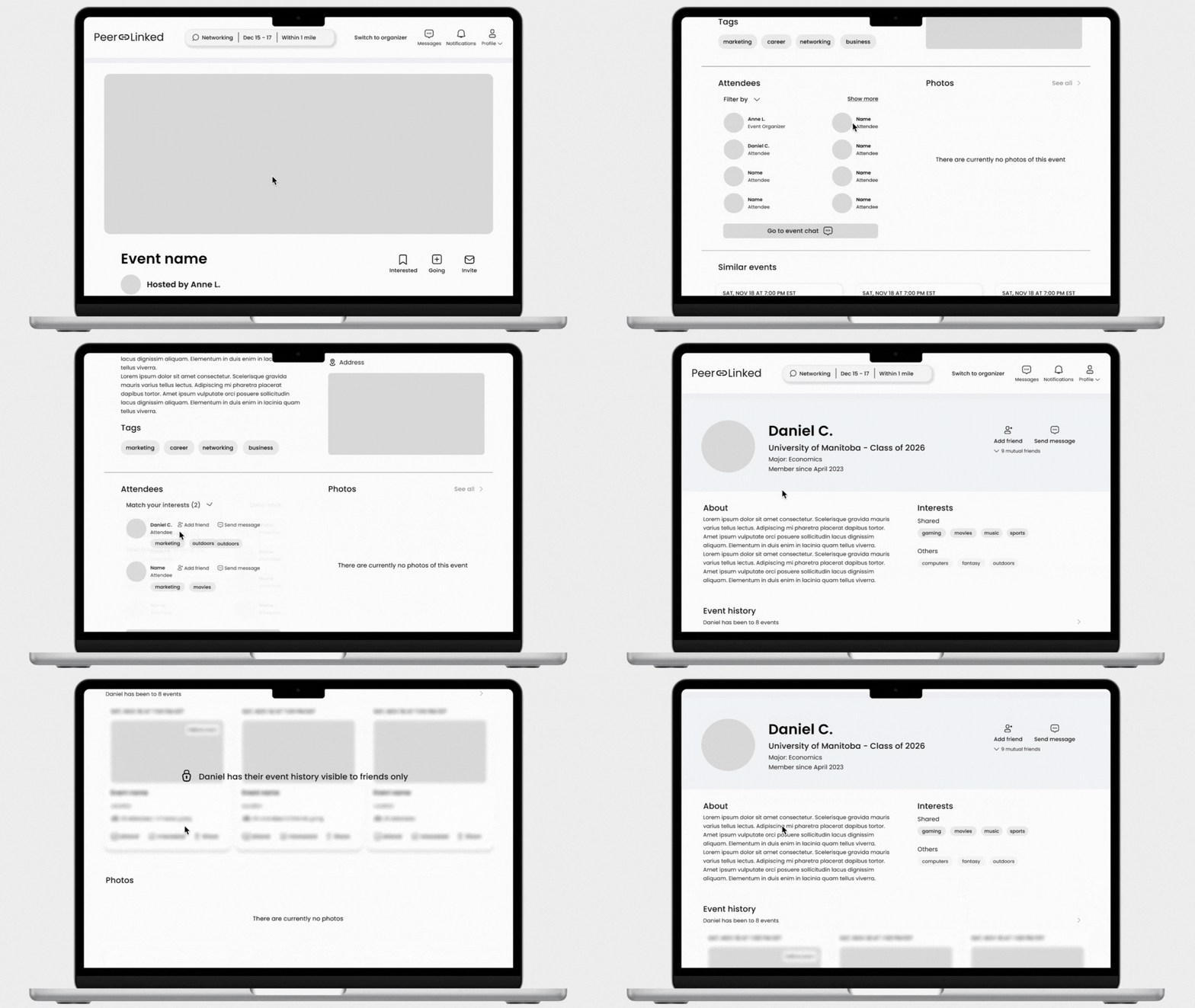
With limited time available, we decided to go straight to designing low-fidelity wireframes on Figma rather than sketches to better visualize the solution and make the transition to high-fidelity wireframes more time-efficient. We also felt it would help make the guerrilla testing on the prototypes feel more realistic for users. We each chose a user flow to design and spent about a week designing and prototyping and then 2 days conducting guerrilla testing on the designs.
Low Fidelity Wireframes
Onboarding
Discovering and joining event
Discovering others with similar interests
We chose to conduct Guerrilla testing since we only had 2 days to dedicate for testing. We recruited users through the Springboard slack channel and asked friends and family as well. We had a total of 5 participants. Users were instructed to complete the 3 user flows we designed for: onboarding, discovering and joining an event, and discovering others with shared interests.
3/5 users didn’t understand what “peer preferences” meant and felt there could be a better explanation.
5/5 users felt the discovering and joining event flow was straightforward and really enjoyed the search experience.
2/5 users were confused about the wording of “interested” on the event banner and page. They expressed it was because the wording was similar to when onboarding and choosing their “interests”. They got confused at first and understood it meant to save the event after seeing the icon.
5/5 users felt that discovering others with similar interests flow was intuitive and had all the information they would imagine on the user profile page.
Lo-Fi Guerrilla Testing
Change the wording to better explain what “peer preferences” means. We included this as part of the account set up because in our survey and research, we found many university students prefer to hang out with the same gender or within the same age range. For this reason we felt the need to keep it and improve it rather than just get rid of it.
Iterations
Before
After
Change “interested” to “save”. This way users won’t be confused between their “interests” and “interested”. “Save” appears more obvious what the function is, especially paired with the icon and it’s familiar with most users.
Before
After
Design & Validate - High Fidelity
As mentioned before, the founder wanted to keep the same fonts and 2 primary colors they used with their other company, My Student Wellbeing. After some discussion with the client, we created a third primary color to add contrast to the bright and bold colors the founder already had.
Branding
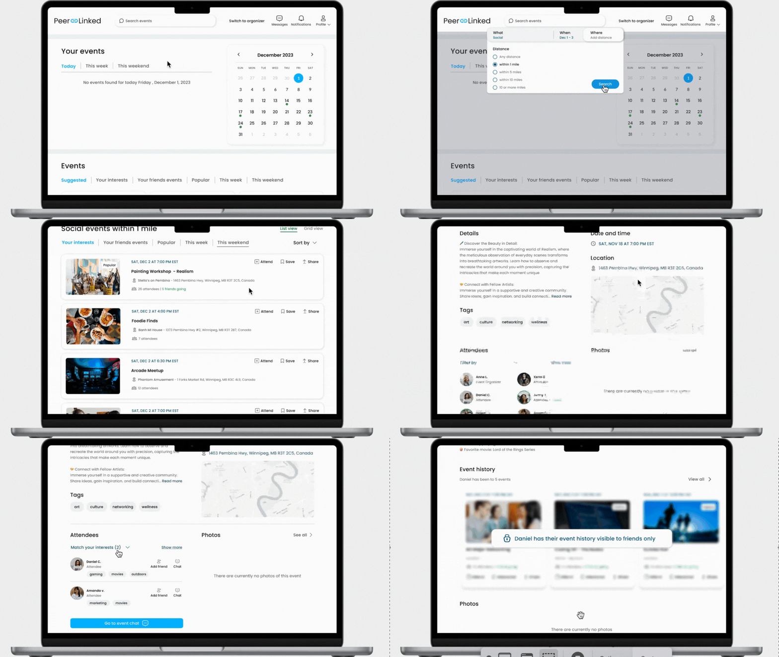
Now that we have the branding completed and have gotten some valuable feedback from users to iterate on our designs, we can move on to high-fidelity wireframes and prototypes! This is genuinely my favorite part of the process because you get to see all your work come together into something that looks realistic.
High Fidelity Wireframes
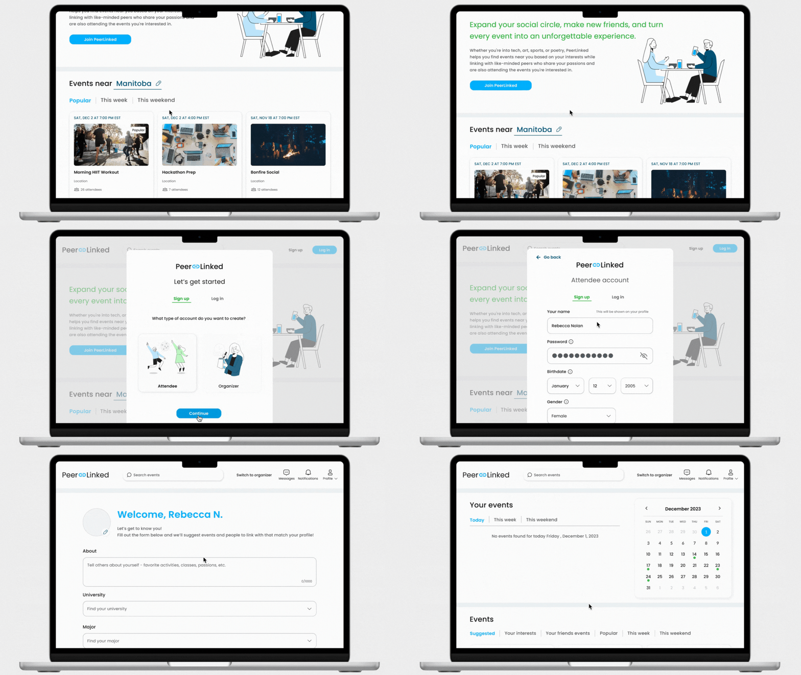
Onboarding
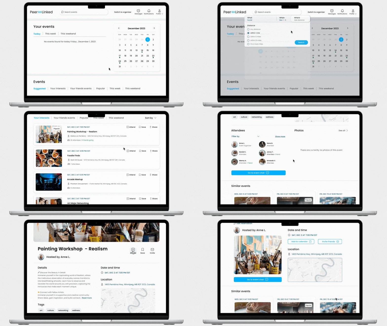
Discovering and joining event
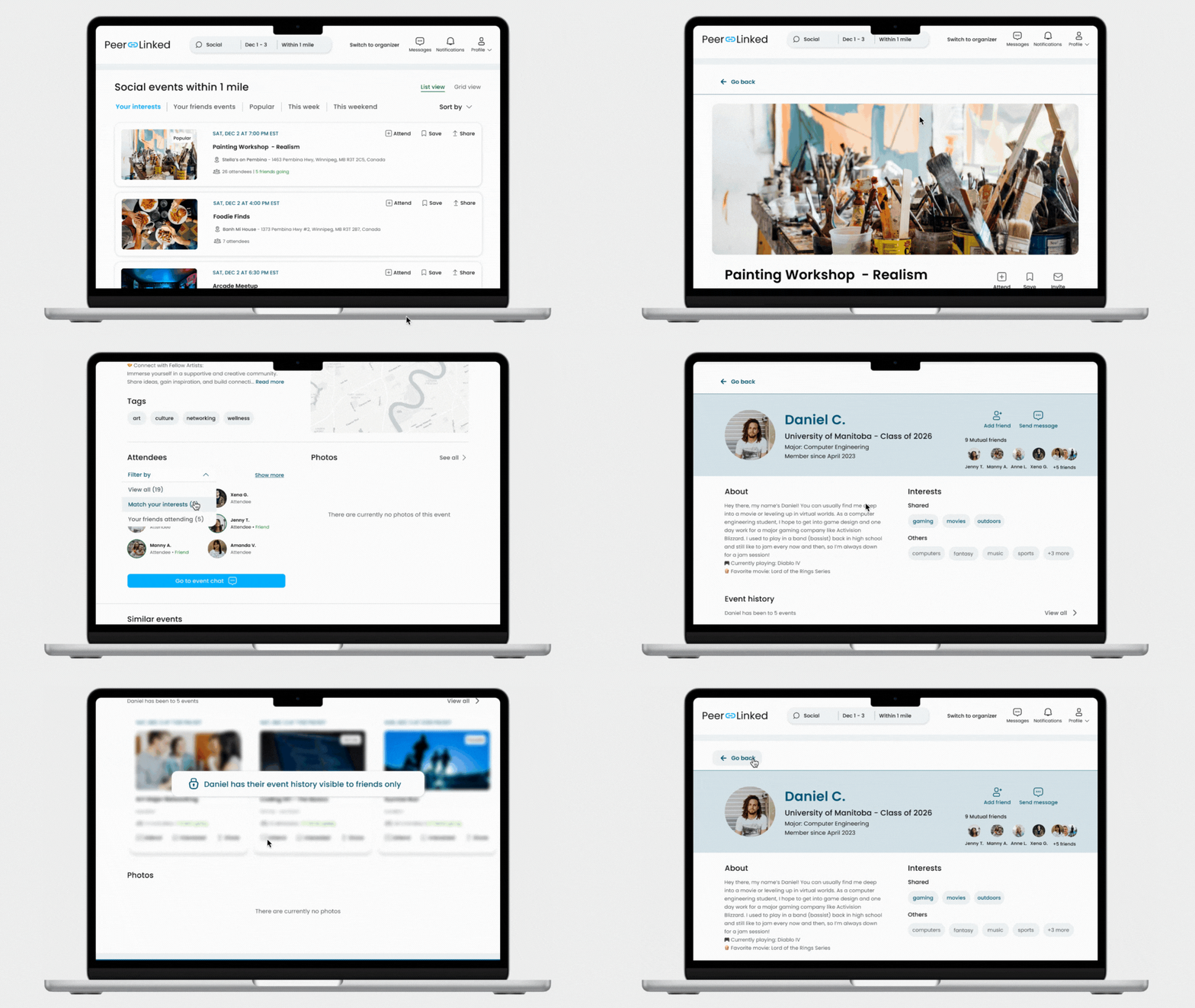
Discovering others with similar interests
For the high-fidelity wireframes, we were only able to recruit 3 new users to test the prototypes with. The changes we made with the feedback from the low-fidelity prototypes were taken well by users and they didn’t have problems completing the tasks. We also made some additional changes to things we noticed ourselves for example:
Although we were focused on designing for an attendee profile, we decided to create the option to sign up as an attendee or event organizer so that in the future when the founder begins to design for that flow, it is already integrated into the design.
Change the order of actions users can take with an event to “going, save, invite.” We felt it made more sense for “going” to come before “save” since that is what people would primarily be using this product for- attending events, not saving them.
Instead of a dropdown menu showing the number of mutual friends a user has with another user on their profile, we chose to show the number of friends and a couple of names with profile photos. We felt it would take away a click a user would need to see mutual friends while also not occupying much more screen space and getting a preview.
With only 3 participants, we didn’t get any new feedback from the previous session. We also met our deadline, so this was the final iteration that was sent to the founder to work with.
💡View the full prototype here!
User Testing
Reflection
Learning to use team dynamics to your advantage is a skill!
Coming from different backgrounds, having different design styles, and just opinions in general adds such a diverse dynamic to a team. With only 4 weeks to complete this project, it was a challenge at first to learn each other’s personalities, styles, strengths, and weaknesses quickly so we could hit the ground running and work efficiently. However, by the second week, we made the time to learn more about each other and finally fell into our places. This is when I realized how important it is to use our differences to our advantage.
Working with a client was an invaluable experience.
Having this experience working with the founder and helping them redesign their product was an amazing experience. They admitted to not knowing much about UX design which was exciting because that means we got to teach them the valuable UX can have on the success of a product and give them insights on all we can offer them. The other side to this is learning how to thoroughly explain why or why not something can/should be done. When the client first explained their product and mentioned there would be 3 different accounts, I had to remind them of the short timeline of the project and ask them what was most important and what the team should prioritize.
If I had more time I would ______
Do more testing!! It was challenging to get enough users to do testing on the prototypes with little time. I would have wanted to have conduct a few more tests to get more complete and well-rounded feedback on the high-fidelity wireframes especially.
Work on the connect and chat feature. Through our research we found many people struggle with initiating conversation in person and online, so we hoped to help users with icebreakers. I would create different icebreaker suggestions for users that would be created specifically for the person they are reaching out to based on that person’s profile- such as information from the banner, bio, interests, and event history. This way it would feel more personal and not like a generic message which may not lead them to respond or making a genuine connection.
Design the event coordinator account! This is definitely the second most important part of this product. The client wanted people to be able to also create events on their web app and while not first priority it would be the next step to having the product be fully functional in the way the client intended it to be.
