Spot 🐶
Spot is a conceptual mobile application, designed to help dog owners find nearby dog parks that meet their specific needs and requirements. With real-time park data, filters, safety ratings, and community reviews, Spot aims to help users discover the ideal playtime destination for their pet.
Role: UX Researcher, UX Designer, UI Designer
Project Context: Personal Project
Product Type: Mobile Application
Duration: 3 months
Tools: Figma, Miro, Marvel POP
The idea for this project came to me because I was in need of a solution like this about a few years ago. My husband and I had just moved to a new city in a new state and we got a puppy within a week of moving there (we couldn’t wait). It was important that we take her to the dog park regularly so she would be well-socialized with dogs and people, while also getting adequate exercise. Since she was a puppy and a small breed to begin with, I wanted a park that had separate areas for big dogs and small dogs. When I searched online for “dog park near me with small dog area” I didn’t get any specific results. I spent every weekend for a month and a half going to different dog parks near me to find one that had exactly what I was looking for and thought there had to be a better way.
The Inspiration 🐾
Problem
Finding the right dog park can be overwhelming when there are multiple dog parks around that have different things to offer.
The rising population of dog owners combined with urban sprawling has led to dog parks being an important part of the community of urban dog owners today. With different reasons, needs, and expectations for visiting a dog park, there isn’t a reliable service that allows dog owners to find dog parks near them with their exact needs and requirements.
Solution
Increase accessibility to local parks and filter different amenities to improve the search experience for users.
Providing users with an improved search experience of local dog parks that meet their needs and requirements, increasing accessibility of dog park reviews to help them find the most suitable parks, and helping share information and updates about their favorite local dog parks with their community.
Discover
The growing population of pet owners combined with urban sprawling has made the addition of dog parks an important amenity to urban dog owners and to park agencies designing these spaces. There are numerous dog parks that offer amenities such as large open spaces, separate areas for different-sized dogs, water bowls, relief areas, trails, agility courses, and rinse-off stations just to name a few. Understanding what features of a dog park are valued most will help dog owners in their search to find a dog park that is the right fit for them and their pup.
Secondary Research
Competetive Research
PawParks
app used to search for local dog parks
simple design but felt outdated
dependent on users reporting parks and filling in park info so felt unfinished
SniffSpot
app used to rent outdoor spaces to let their dog(s) play
easy-to-use UI
clean aesthetic with minimalist design
BringFido
app used to find pet-friendly places to stay, play, and eat with a dog/dogs
park search is difficult to navigate
fun, energetic aesthetic with lots of information
Taking what I learned from my research, I created a quantitative survey and conducted qualitative interviews with those who were ideal candidates. I created the survey using Google Forms which allowed me to collect surveyors' information. There were a total of 38 respondents, of which 5 were invited for a 30-minute interview over Zoom. With a better understanding of the problem space, I prepared screener surveys and user interviews with 3 essential questions in mind:
User Interviews
1. What features do dog owners prioritize when choosing a park to visit?
2. How do dog owners currently search for dog parks in their area?
3. What is the dog owners' current end-to-end journey when considering and visiting a dog park with their dog?
Define
The interviews gave me valuable insight to work with. I created an affinity map to help identify patterns and key points. I was able to come up with 12 common themes that represent what things dog owners prioritize, their pain points, and their expectations from the search experience. Some key points noted were:
Affinity Mapping
💡 When deciding on a park to visit, dog owners prioritize proximity to the park, things to do at the park, amenities offered at the park, and the park’s reputation
💡 Most dog owners go to let their dogs burn energy and exercise
💡 Socialization is another big reason dog owners take their dogs to the dog park, some prefer a busy park while others prefer an empty park
💡 Currently, many dog owners use multiple search tools - to see location, distance, photos, and reviews
With the information gathered, I created two different personas to get a better idea of the user I am designing for. This is what really allowed me to see what specific needs, goals, pain points, and motivations users have when it comes to the search experience of dog owners looking for local dog parks that fit their specific needs.
User Persona
Trying to put myself in the user’s shoes, I used the phrase “as a dog owner, I want to …” along with my personas to help me approach creating user stories empathically and discover the MVPs. I had quite a few MVPs, so I grouped them into categories of “must have, should have, and could have” to help define the scope, key features, and content to be included and prioritized in the solution.
User Stories
Having established the MVPs, I moved on to creating a site map and user flow based on all the information gathered. The site map helped establish a clear hierarchy for the main navigation menu of the app. With an organized visualization of the site, I created user flows of the red routes to be prioritized.
Site Map & User Flow
Site Map
User Flows
Develop
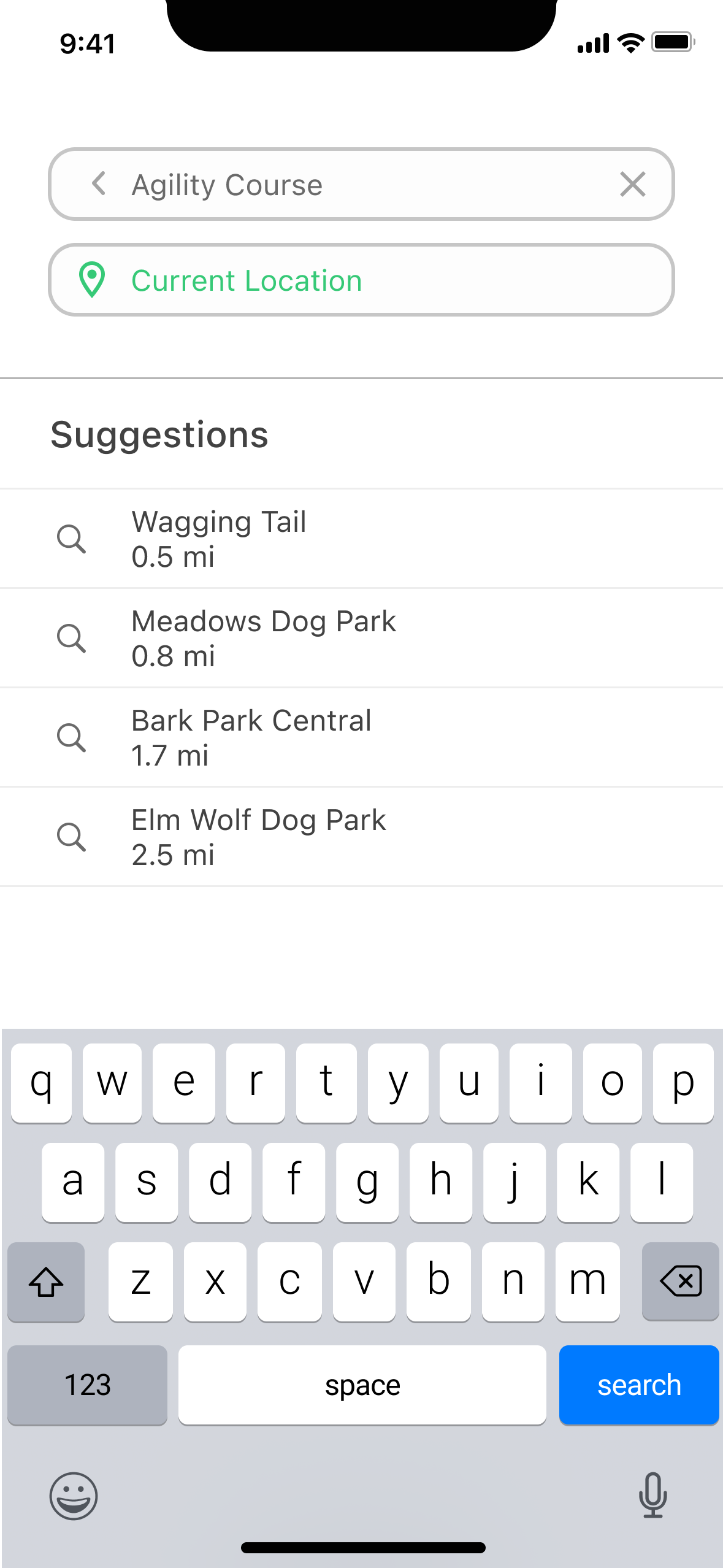
Using the user flows and site map to guide my red routes, I started with basic sketches. I looked to Yelp for inspiration on how I wanted the main search experience of the app to function. I also knew I wanted the app to have 3 main features: search, favorites, and community. These would become part of my tab bar.
Early Sketches
After completing the sketches, guerrilla testing was done to get feedback on the basic functionality and features of the app. My main goal was to validate that the low-fidelity prototype was easy to navigate for users looking to complete the designated red route tasks while seeing what improvements could be made early in this stage. I tested with 5 different users remotely via Zoom over the course of a week. Overall, users understood the primary purpose of the app and found that the flow was smooth, and felt familiar and intuitive.
Guerilla Testing
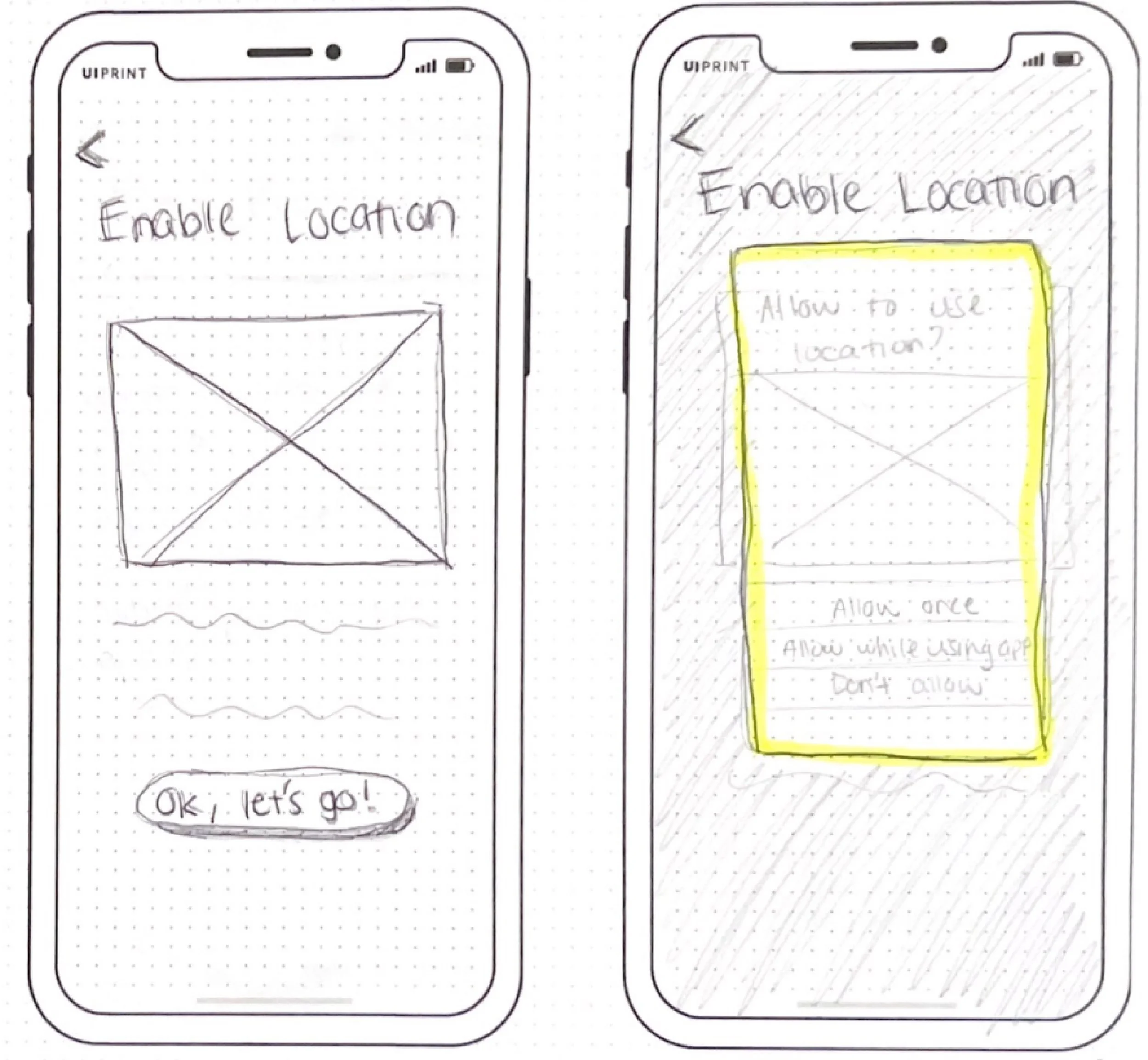
Before
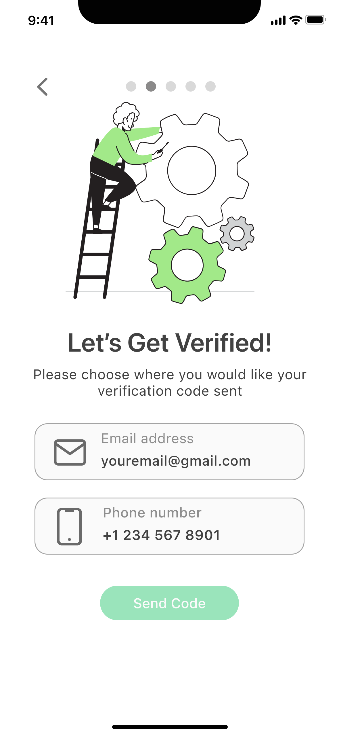
Some users mentioned the wording of the “enable location” settings screens during the onboarding made them feel that they automatically accepted to enable location sharing and didn’t have a choice.
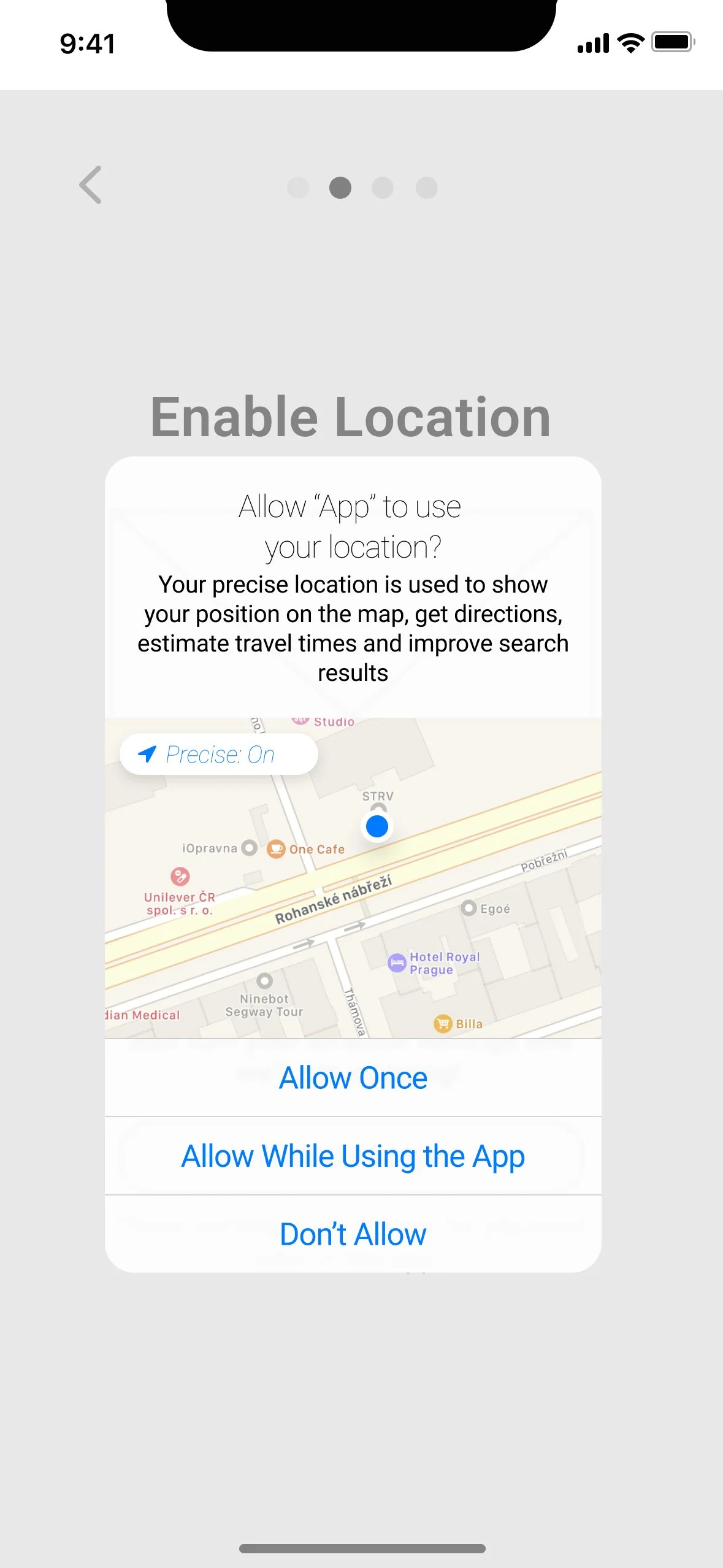
After
With that feedback, I made adjustments to the wording while also giving a disclaimer that location settings could be modified later in the app, this way users understood they had a choice in enabling their location.
Low-Fidelity Wireframes
Upon completing the updated lo-fi screens, I started to think about the branding of Spot. With the app goals in mind, I wanted the brand personality to be sincere and thoughtful, with the purpose of building meaningful experiences and connections. I wanted the brand attributions to be friendly, helpful, approachable, and user-friendly. This helped me create a style guide that reflected these things.
Design System
App Logo
The logo is represented by a location pin icon with a paw print inside to indicate the apps intention of helping users look for dog parks. The name “Spot” is a play on the typical dog name Spot and the name for a place.
Colors
Contrast Safe Alternatives
Typography
Iconography
Illustrations
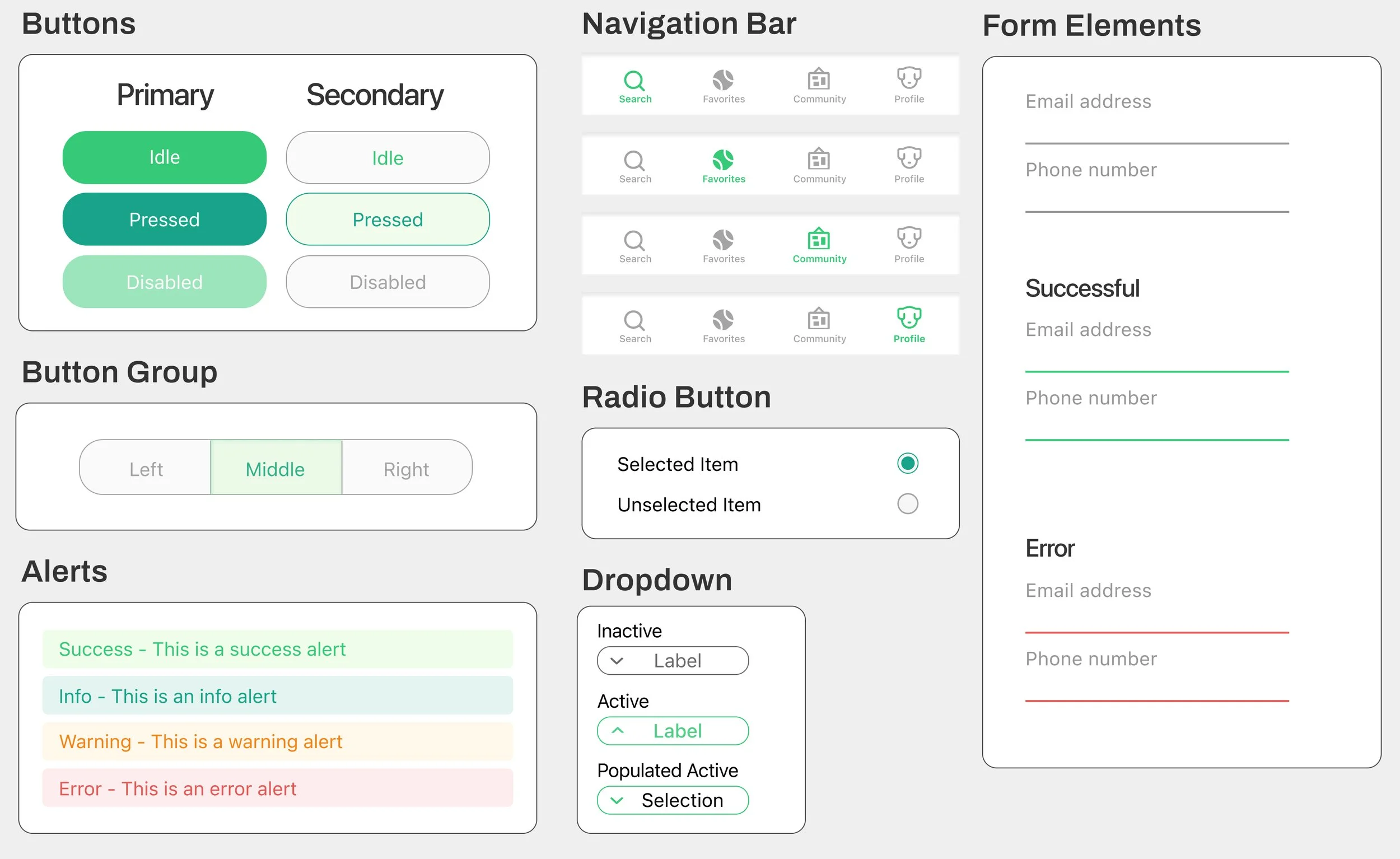
Components
Deliver
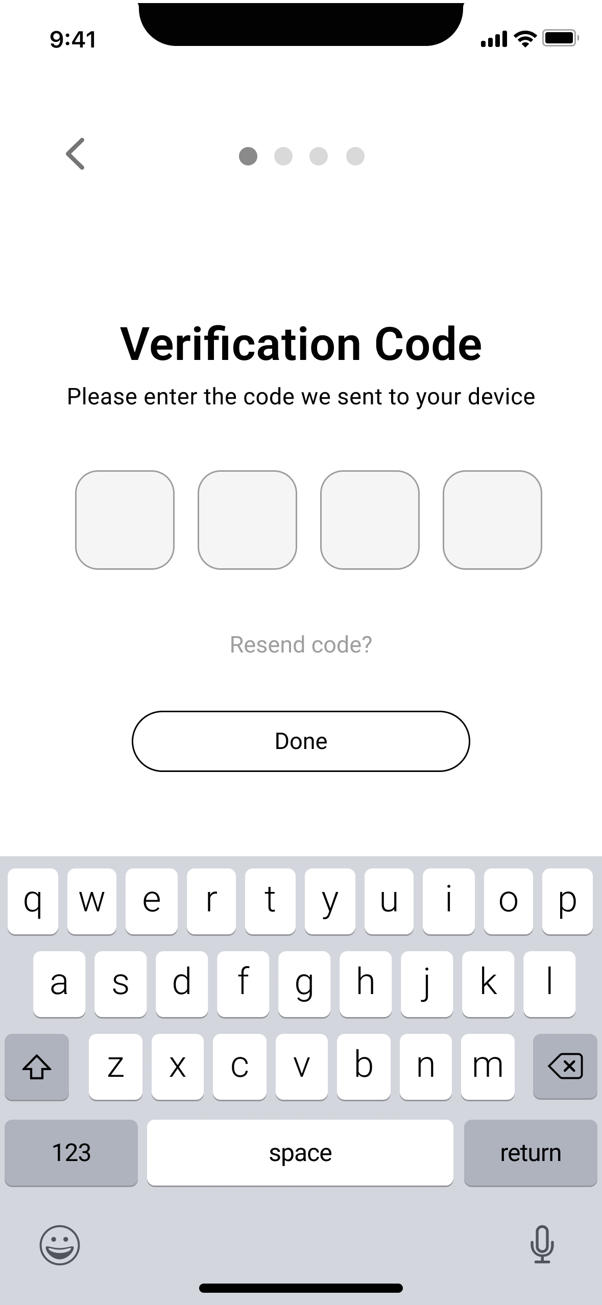
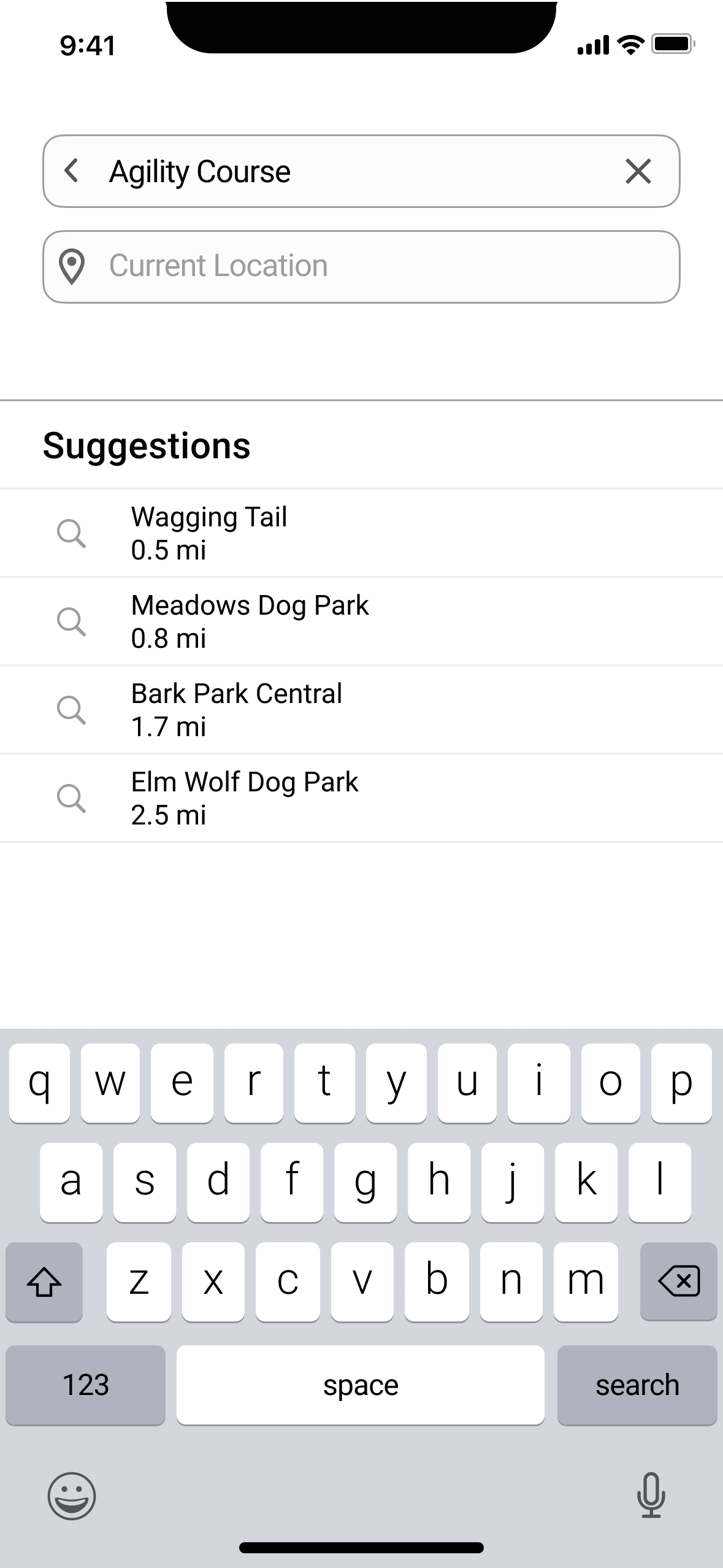
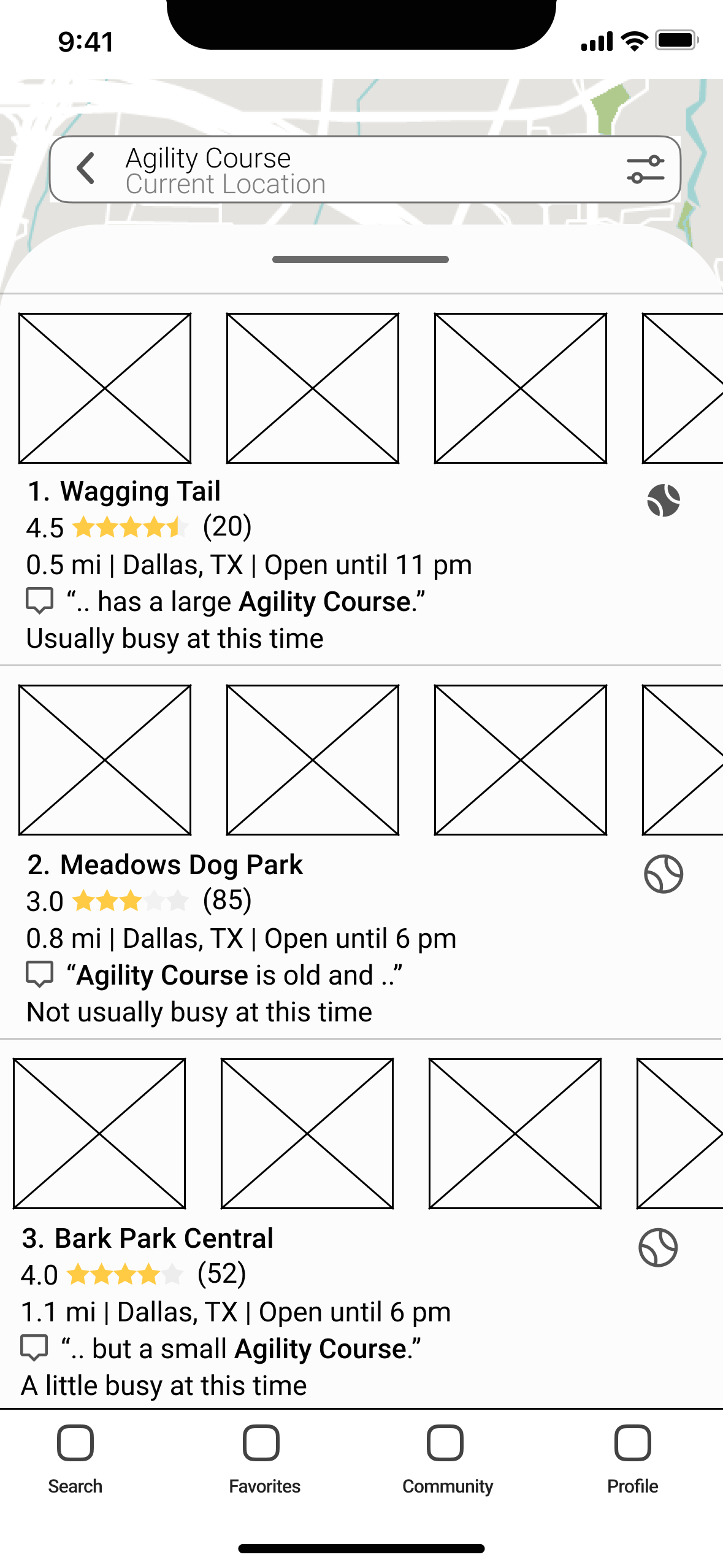
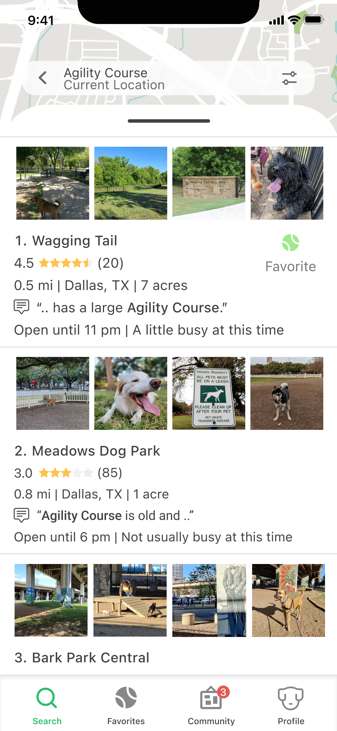
Combining all the elements shown throughout the design process, I created a hi-fi prototype to do usability testing on. Two rounds of moderated usability testing were performed.
Round 1
The first round of testing consisted of 6 participants. The majority of users had a hard time completing the park search portion. This being the major goal of the app, I took the feedback and iterated on the search experience to be more obvious to users on what can be searched and how to complete the search process.
Round 2
A second round of testing was completed with 5 new participants. During the second round of usability testing with the improved search experience, users were able to complete the search experience without any confusion.
Usability Tests
High-Fidelity Wireframes
click here to interact with the prototype on Figma!
Reflection
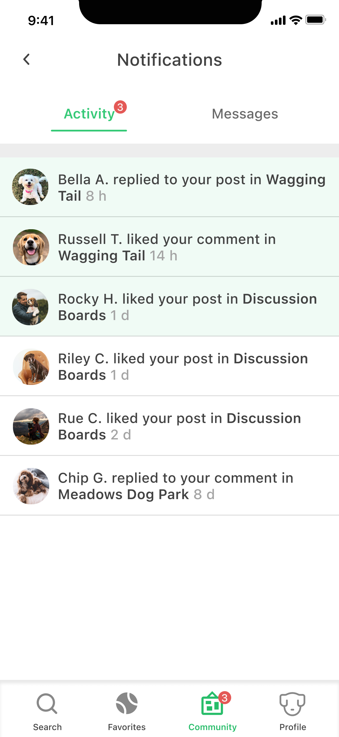
Once I completed the necessary red routes for the project (onboarding, search experience, and park page with reviews), I decided to create the pages for favorites and community pages to make the prototype feel more complete. I was particularly curious to work on the community feature and create a social aspect to it. Although the community page wasn’t a part of the red routes, being part of a community was something users mentioned they looked for when going to dog parks, and therefore I felt should be prioritized next. With data received from the survey and user interviews, it was important the community page include:
A bulletin board for users to discuss and catch up on things related to their favorite parks (events, lost dogs, maintenance schedules, etc.)
A general discussion board for users to discuss all things dog-related (not specific to any dog park)
Notifications on posts liked or commented on by other users
If I had more time I would love to test the community page with users to see if it meets their expectations or if they feel more could be added or changed.
Additional Thoughts.. 💭
One of the biggest lessons I learned was the importance of testing. With 3 total rounds of testing, I learned so much about what users expect and want out of an app like this. I also learned that your personal experience, journey, and knowledge are not the same as others. Just because it makes sense to you doesn’t mean it will make sense to everyone or in the same way.
Test, Test, & More Testing
Another lesson I learned was to make things obvious! People tend to not thoroughly read through pages and assume how something is going to work. Make every interaction obvious to the user so there is no room for confusion or assumptions. Spell it out!
Crystal Clear
Keeping things familiar goes hand in hand with making things obvious for users. As Jakob’s law states, people spend most of their time on other apps and expect them all to behave the same way. During usability tests, users would mention how the app felt intuitive and like other apps they’ve used in the past which made it easy to navigate. For this reason, designers have to balance trying something new and different versus sticking with standards and what users are already familiar with.
