GalleryPal🖼
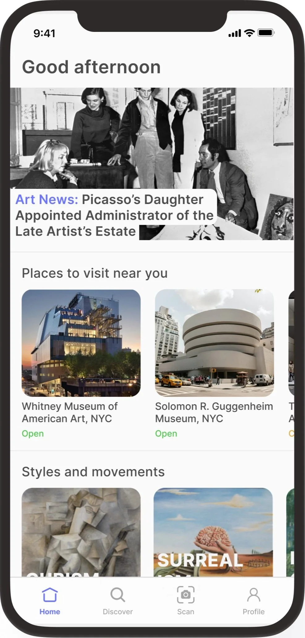
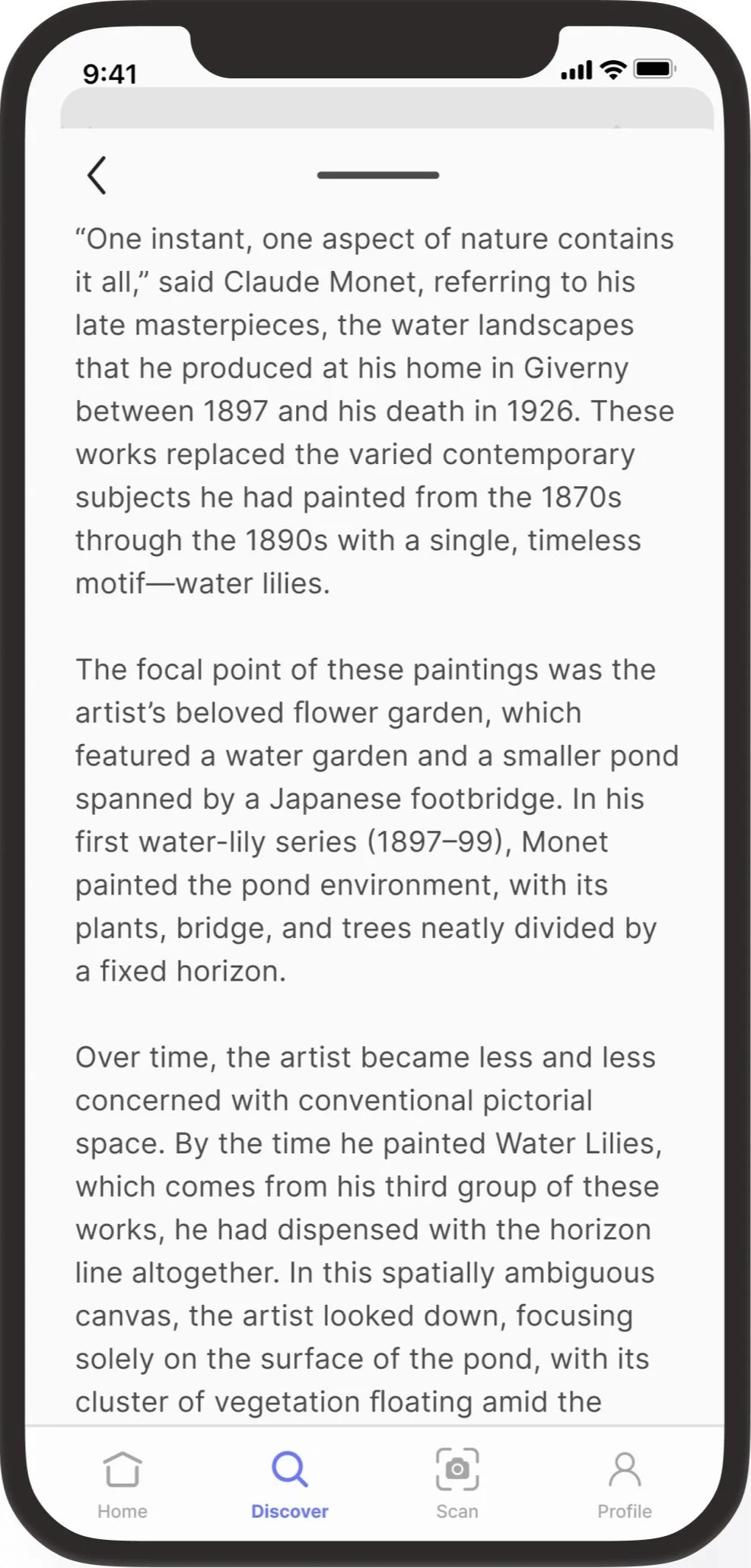
GalleryPal is a conceptual mobile application that aims to improve the experience of viewing art at museums and galleries. Through this 5-day Google Venture design sprint, I designed an immersive way for visitors to engage with the pieces at museums and galleries, giving them a better understanding and appreciation of the art around them, and ultimately giving visitors a better viewing experience.
Role: UX Designer, UI Designer
Project Context: Personal Project
Product Type: Mobile Application
Duration: 5 days
Bitesize UX provided the resources for this modified design sprint including the challenge goals, constraints, user research, persona, and recorded user interview.
Tools: Figma, Miro
I was excited to learn that performing a GV design sprint was a part of my coursework and really took this opportunity to get a good grasp of this methodology. The idea of condensing complex design problems into a structured, time-bound process was both challenging and exciting. With a desire to cultivate a holistic understanding of user-centric design, continual education and growth is important to me. Learning this approach to a design problem will make me better-equipped to tackle diverse projects and deliver innovative solutions in my evolving role as a designer. Keep reading to see how it went! 😋
Day 1: Understand/Map
Constraints
Focus on improving the in-person viewing experience
The solution should be designed as a mobile app or mobile-optimized website
Goals
Design a way to improve the experience of viewing art in a museum or gallery
User Quotes
“I enjoy looking at art, but sometimes I feel like I’m missing out on the full experience by not knowing any background information or context.” - Anna
“I like to form my own opinion about art, but it can be hard to do when I don’t really know anything about the artist or what their intentions were in creating the work.“ - Jane
“I may do a little research before my visit, but I always find a work of art that catches my eye that I didn’t read on beforehand.” - Claire
User Persona
The provided research focused on understanding the user’s experience viewing art at a museum or gallery. After reviewing the provided research materials, I worked on coming up with a map that focused on a possible end-to-end experience a user might have with the app.
Site Map
I thought it was important to focus on a solution that would provide quick and thorough results. Being able to scan a piece of artwork would allow the user to quickly read on that piece, gaining just enough insight quickly. If they want more information, they can go to the artworks page and/or the artists page and read more information. Because I felt this was more in line with Angela’s goals, I decided to move forward with the first map.
Day 2: Sketching
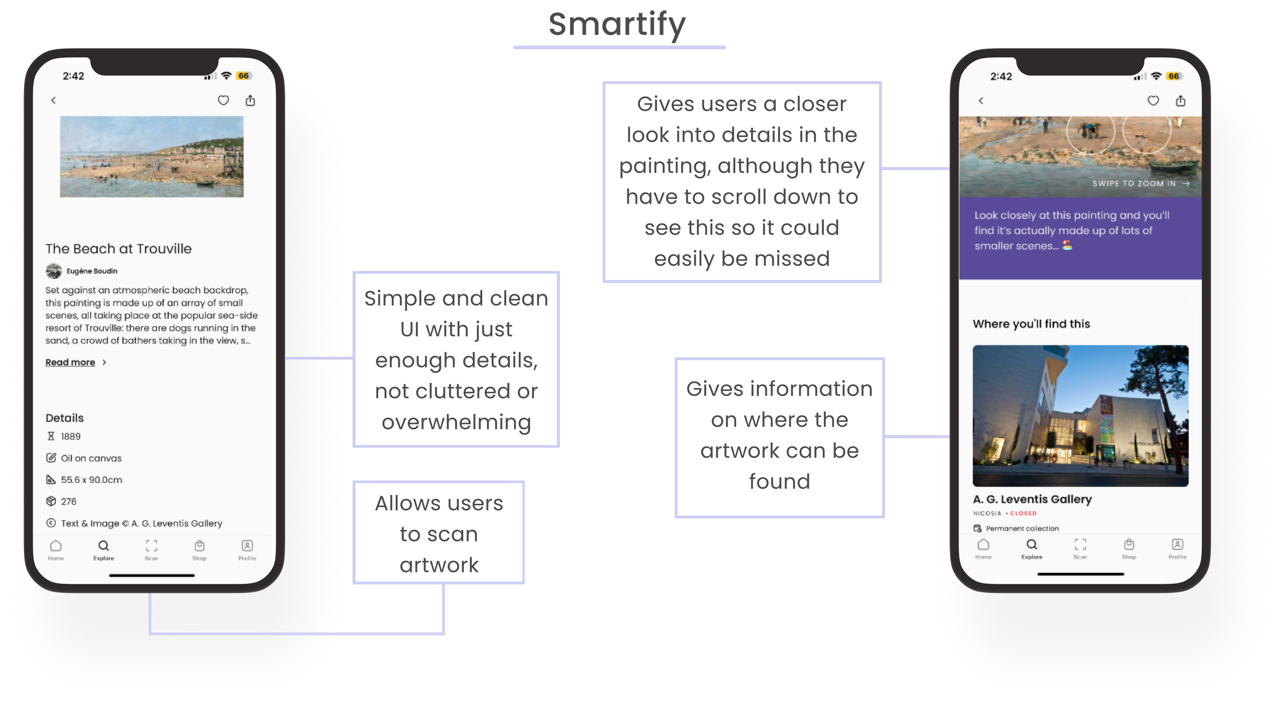
I began reviewing other art-focused apps to draw inspiration from. Although not all of them offered a similar solution, they were within the same realm of showcasing artwork and providing users with details. The ones I ultimately drew inspiration from are shown below.
Lightning Demos
Crazy 8 Sketches
I used the crazy 8s method to come up with some possible solutions. The majority of users during the user interviews said what would make their museum or gallery experience better was if they knew more information on the artists and the specific art pieces. For this reason, I thought this screen was the most critical to sketch different variations of.
Winner!
Crazy is a great way to describe these sketches.. 😅
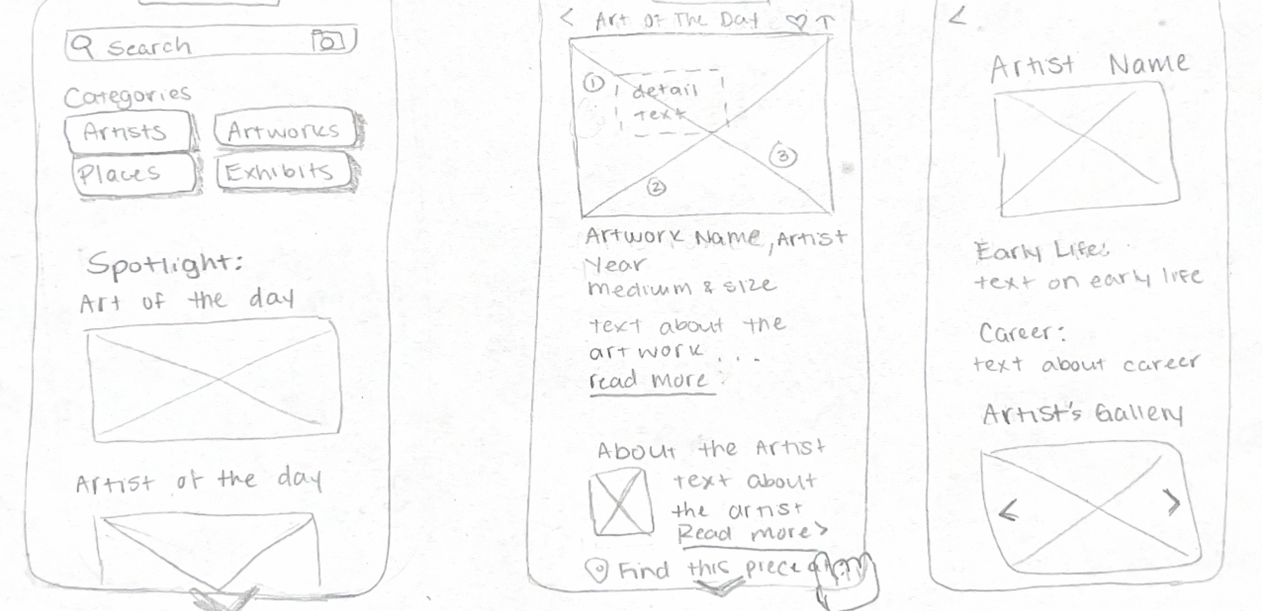
Of the 8 variations of the critical screens above, I chose the very last sketch to be part of my solution sketch since I felt it best displayed all the necessary information for users in an easy-to-read way. With that, I sketched a three-panel storyboard, the screen before the critical screen, and the screen after the chosen critical screen.
Solution Sketches
Three-panel solution sketch with critical screen from crazy 8’s in the middle
Day 3: Decide
As a UX team of one, I continued adding screens to the storyboard sketch from the day before. Using my user map from day 1, I made sure to cover all the necessary steps users would need to improve the end-to-end experience of scanning a piece of art and reading information on it.
Added more critical screens to the sketches from before using the user story map
Day 4: Prototype
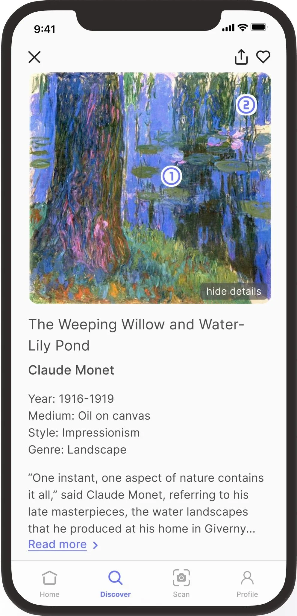
Using the completed storyboard as a guide, I created a high-fidelity prototype of the critical screens to test functionality and usability with users. As far as design elements, I based the color palette on the GalleryPal logo and chose a simple font that would represent that of an art gallery.
click here to interact with the prototype on Figma
Day 5: Test
I conducted one round of testing remotely over Zoom with 4 participants to test the prototype. Users were given the prompt to imagine they were at an art museum and wanted to search for the artwork in front of them using their phone’s camera through the app. Users shared their screens as they completed the task.
I had two user tests before my weekly call with my mentor. During my call with my mentor I mentioned that during my first two user tests, it seemed they were only noticing the “scan” text and icon in the navigation bar, rather than going to search and then hitting the “scan” icon on the search bar. Although this was only based on two users, it made me wonder if having both options was redundant or if it was perhaps circumstantial. My mentor mentioned conducting a test to help gauge an answer.
Since the first two users started from the homepage and went straight to the navigation bar to find the “scan” icon and title, I had the next two users start from the search page to see what they would do if they were presented with both options from the start. Interestingly, they both clicked on the icon that was within the search bar. When asked why they chose that one instead of the one in the navigation bar, they mentioned they didn’t even notice the same icon was in the tab navigation bar and went to the first thing they saw and that made sense to them.
With this, I think at this time, it makes sense to keep both options in case a user just so happens to miss them in any circumstance, they will still have the option to see it. Overall users felt the app was easy to navigate and didn’t feel cluttered with unnecessary information.
Reflection
If I had more time, I would love to run a much bigger test on the whether users find it more intuitive to find the scan option in the navigation bar or from the search page. Given the time constraints of a GV design sprint and only having 4 participants to test with, it led to a 50/50 tie and the results inconclusive which led me to keep both options. However, with more users to test with, I think a more concrete answer would be found whether having both options is redundant or necessary.
Having experienced this modified version of a GV design sprint, I can see how this can be an effective way to come up with solutions and test them when timelines are short and budgets are tight. Having done this as a solo designer, I can only imagine how much more powerful this process is when done in a team setting.
This experience helped me remain focused on the user and the user’s needs from the product, after-all we are designing this for users!
The thought of doing crazy 8’s for the first time made me a little anxious that I wouldn’t finish within the 8 minutes but looking back now, I see how effective this method can be in quickly coming up with solutions without overthinking.
Overall, I feel having completed this has made me more confident in designing and testing in such a short amount of time, and excited to give it another go and grow this skill.
